Want to Stand Out at a Craft Show? Try these Display Tricks
Relating your craft show booth or table to a store window is a good way to look at your space from a different perspective and ensure you have elements that will catch the eye.
Although you may only have a few feet, you also want to think of your table or booth like the inside of the store and create a layout that draws shoppers in on one side and then has a setup that allows people to shop and pay without blocking your eye-catching elements.
You only have a few seconds to grab shoppers’ attention, so you need your craft show booth to stand out.
These techniques will help.
TOP 10 VISUAL MERCHANDISING TECHNIQUES
These are techniques major retailers use because they translate into dollars.
I studied these techniques in college and have implemented them for multi-million dollar retailers and in my own craft show booth.
So I know they work and have seen the impact they have on sales.
- COLOR
- REPETITION
- LINE & COMPOSITION
- LIGHTING
- SCALE
- CONTRAST
- HUMOR
- NOSTALGIA
- MOTION
- SURPRISE

1 – COLOR
Color is the best way to catch the eye, evoke an emotion, and even tell a story (e.g. blue and beige can help communicate a “beach” story while pastel purple, yellow, and blue can help tell an “Easter” story).
Every craft show display should (properly) use color.
Consider your target market and the colors they’re likely to be attracted to. Are the soft pastels, earth tones, or dark and moody colors?
Typically, the fewer colors used, the stronger the impact (and the easier it is to create a cohesive display).
Imagine an all-red display showcasing ruby jewelry.
However, a booth full of color can also work. It takes a little more technique, but a display full of primary colors can also grab attention and even tell a whimsical story (great for children’s products).
The absence of color is another way to stand out, letting your products do the talking. White walls, floor, tablecloth, props, and uniform are bound to make shoppers stop and take notice.
You can read more about how to use color in your craft show booth here.
Used in a craft show display
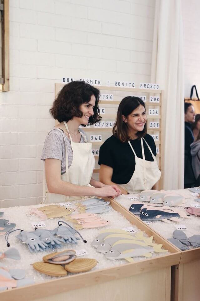
Here’s a craft show display by Don Fisher that properly implements color. Please see more of their photos and an explanation of all the visual merchandising techniques they’ve successfully implemented, at the end of this article.
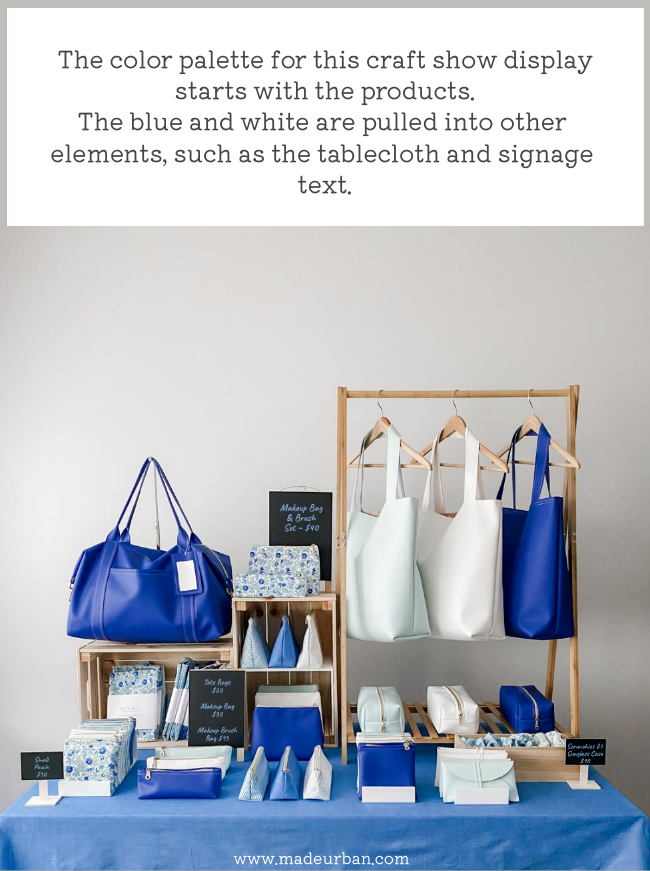
You can also plan your products with a color palette in mind. A blue and white product line makes a strong visual statement.
Used in retail
An eye-catching hot pink color is pulled from the product label and used in some oversized tassels that mimic the tassels on the bottle in a Jo Malone window. This window also uses REPETITION with the same product being displayed 3 times. (Image Source: VM)

An all-white window with bright lighting at JOSEPH really catches the eye (Image Source: VM)

2 – REPETITION
Repetition is another merchandising technique that should be used in EVERY craft show display.
It should start with your products.
Limit your selection (proven to have increased sales by 27%) and ensure elements are repeated within your products.
For example, every piece of jewelry may be made out of copper and use geometric shapes. The designs may be different but the repetition of color and shape creates cohesion across all the products.
Repetition should also be applied in the way you display your products.
You may:
- Repeat colors from your products in your props, signage, images, tablecloth, etc.
- Repeat a product that is displayed (e.g. set up 3 bust forms and have them all wearing the same necklace; one in each stone.)
- Repeat shapes within your display (e.g. create a pyramid shape by stacking bars of soap on risers. Repeat that pyramid shape using jars of cream and bottles of bubble bath)
Odd numbers tend to be more pleasing so repeating and element 3, 5 or 7 times is the way to go.
More examples are shared in the free email challenge: 5 DAYS TO A STANDOUT DISPLAY.
Here are a few examples of using repetition in the elements that surround products in a craft show display.
In the photo below, signage, props, risers, and color are repeated. A spring collection could be inserted into this display:

The display below also repeats signage, props, display fixtures, and colors, but in an asymmetrical setup.

Find more examples and ideas for implementing repetition in: How To Use Repetition in a Craft Show Display
Used in a craft show display
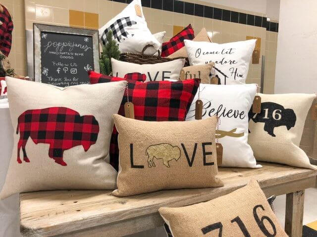
Here’s a craft show display by Poppiejanes and their effective use of repetition through shapes of products, colors, and patterns (notice in the top left how the vendor is even wearing a black and red buffalo plaid shirt to coordinate with her pillow covers). See more of their photos and an explanation of all the visual merchandising techniques they’ve successfully implemented, at the end of this article.
Used in retail
Color, pattern, lines, and products are all repeated throughout this Louis Vuitton window. (Image source: VM)

A clutch is repeated 3 times in a window at Anya Hindmarch showing off the product and varying color options. (Image source: VM)

3 – LINE & COMPOSITION
Another merchandising technique that should be used in every display (the rest of the techniques in this article are optional).
Compositions purposefully lead the eye around your booth or table.
This is done by deciding which element is going to grab the shopper’s attention first (usually the bigger, brighter display at eye level or above), then creating a trail for the shopper’s eye to follow, from one display element or product to the next.
This is why laying products flat on a table does not help attract more shoppers or encourage more sales.
When everything is on the same level, the same size, or stacked/piled in the same way, nothing catches the eye or creates a path telling shoppers where to look next.
When line & composition isn’t implemented, the display can look cluttered and overwhelming to shoppers.
Line & composition can be difficult to master but is important to get right.
Once you understand it, you’ll notice it being used in store windows, in-store merchandising, photos, advertisements, etc.
When standing back and looking at your display, one element should grab the eye. From there, products, groupings of products, props, or signage should catch and direct the eye around your display.
The eye is naturally drawn to bigger/higher/brighter/lighter/etc. objects in a display. These act as “stop lights”; telling the shopper to “stop and look at this item”. How objects are overlapped and directed within a display will create “traffic lanes” for the eye to follow to the next stop light.
This setup uses line and composition to catch the eye and lead it to other items.
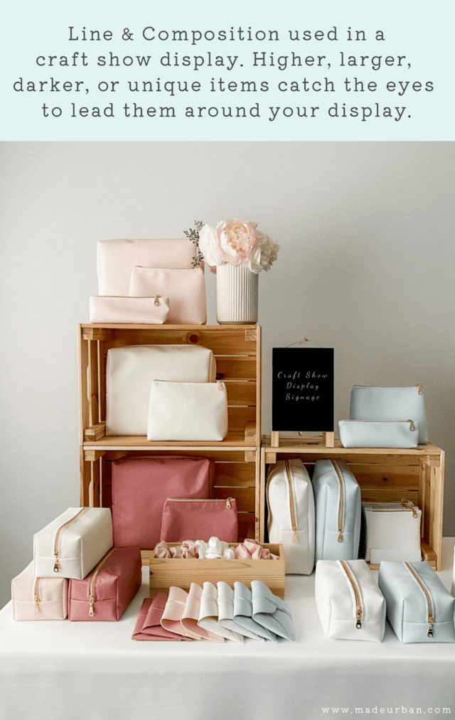
It’s like a game of connect-the-dots.
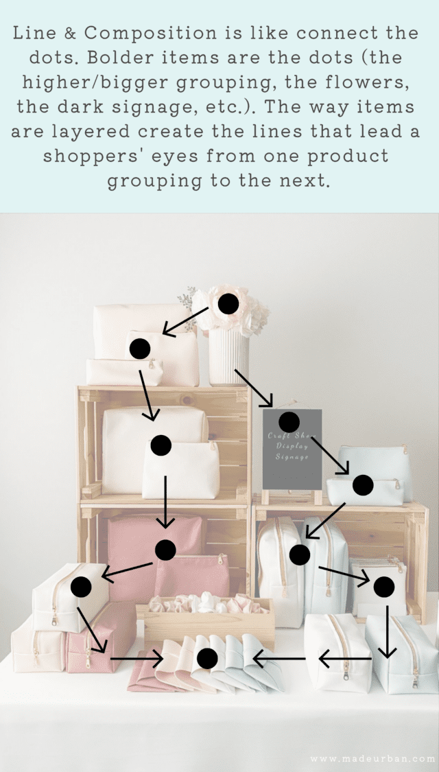
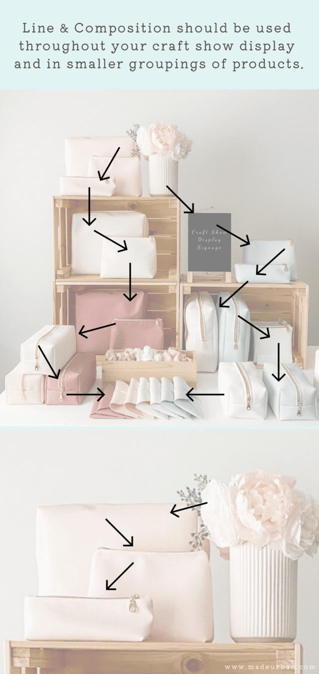
Use line & composition throughout your entire booth AND within each element.
The photo above is an example of the technique used across the entire display.
The photo below is an example of line and composition applied to a smaller grouping within the display.
The way the products overlap and go from tallest to shortest creates a visually pleasing grouping and the eye naturally flows from one product to the next. There’s no confusion about where to look next.
Used in a craft show display
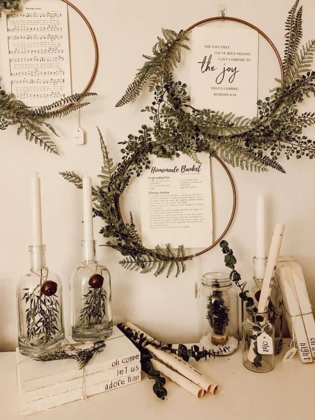
Here’s a look at Our Blue Abode‘s craft show display and their effective use of LINE & COMPOSITION. Notice how your eye is drawn down from the wreaths on the wall, and onto the product groupings on the table. I explain how she’s successfully created flow and share more photos of her displays at the end of this article.
Used in retail
Depending on which way someone approaches this Harvey Nichols window, their eye is either drawn to the brightly lit group of 3 mannequins and then follows the angled line and writing to the 2nd group of mannequins or the opposite; the contrast of the white hashtag on the black background grabs the eye first and leads it down the angled “work hard, play hard” line to the 3 mannequins. (Image source: VM photo credit Melvyn Vincent)

You could literally draw a continuous line from one display element to the next. The overlapping of products, props, and mannequins, the way the mannequins are angled (even the line of the leg on the mannequin in the tan coat directs your eye to the next element).

The beautiful floral art grabs your eye at LK Bennett as the oversized paint tube & brush lead the eye to the product (colorful shoes). On the other side, if your eyes are down as you walk by, the flower paint spilled on the sidewalk will lead your eye into the window in the reverse direction. (Image source: VM)

Consider the flow of your craft show table too. You want shoppers to:
- Be drawn in at the front of your space by a showstopper
- Be led to the middle of your table where they can browse and try items on, pick them up, etc.
- End at the “cash desk” where they can be out of the way of other shoppers while they browse smaller “add-on” items and complete their transaction (think of the checkout line at the grocery store; why not, I’ll grab a pack of gum, it’s only a couple bucks, it’s right here and it’s simple to add to my cart. Check out: HOW TO USE ADD-ONS TO SELL MORE HANDMADE).
CRAFT SHOW LAYOUT TIPS thoroughly explains how to break your display into zones that encourage stopping, shopping, and buying.
4 – LIGHTING
Brighter objects naturally grab the eye, so lights in your space can make your entire booth stand out, or highlight a section of your display.
Even if you don’t have access to electricity, there are plenty of battery-operated lighting options.
For lighting in a craft show display, consider:
- Lamps
- Christmas lights
- Fairy lights
- Battery-operated candles
- Neon signs
- Etc.

Lighting can also set the mood or create a different atmosphere.
For example, battery-powered candles throughout a display might create a romantic vibe or a calming, spa-like vibe, depending on what the vendor is selling (e.g. jewelry vs. bath products).
Mini lights wrapped around a tabletop Christmas tree can catch the eye and make a space look festive at a holiday craft show.
Ideally, the craft show venue will have good lighting. But if the space has limited lighting, adding lights to your display will help it stand out.
Be sure to ask the organizer if you’ll have access to electricity before you plan your display around lighting that needs to be plugged in. And be sure electrical cords won’t be a tripping hazard (you may want to bring Gaffer tape if your cord will run along the floor where people walk).
Used in retail
The light fixtures and light draw attention to each individual shoe at Charlotte Olympia. (Image Source: VM)

Gucci directs spotlights on each mannequin to make their bold colors stand out even more (Image source: VM)

Macy’s uses light bulbs and their cords to create a tree design and add extra lighting to the window. (Image source: VM)

5 – SCALE
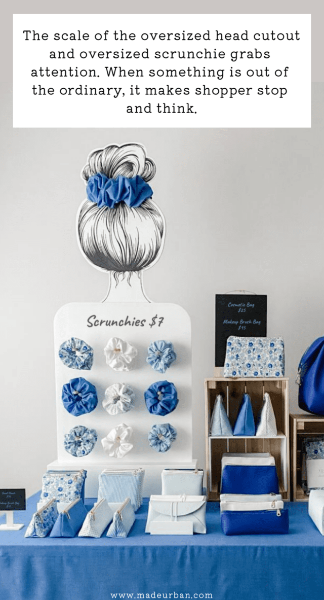
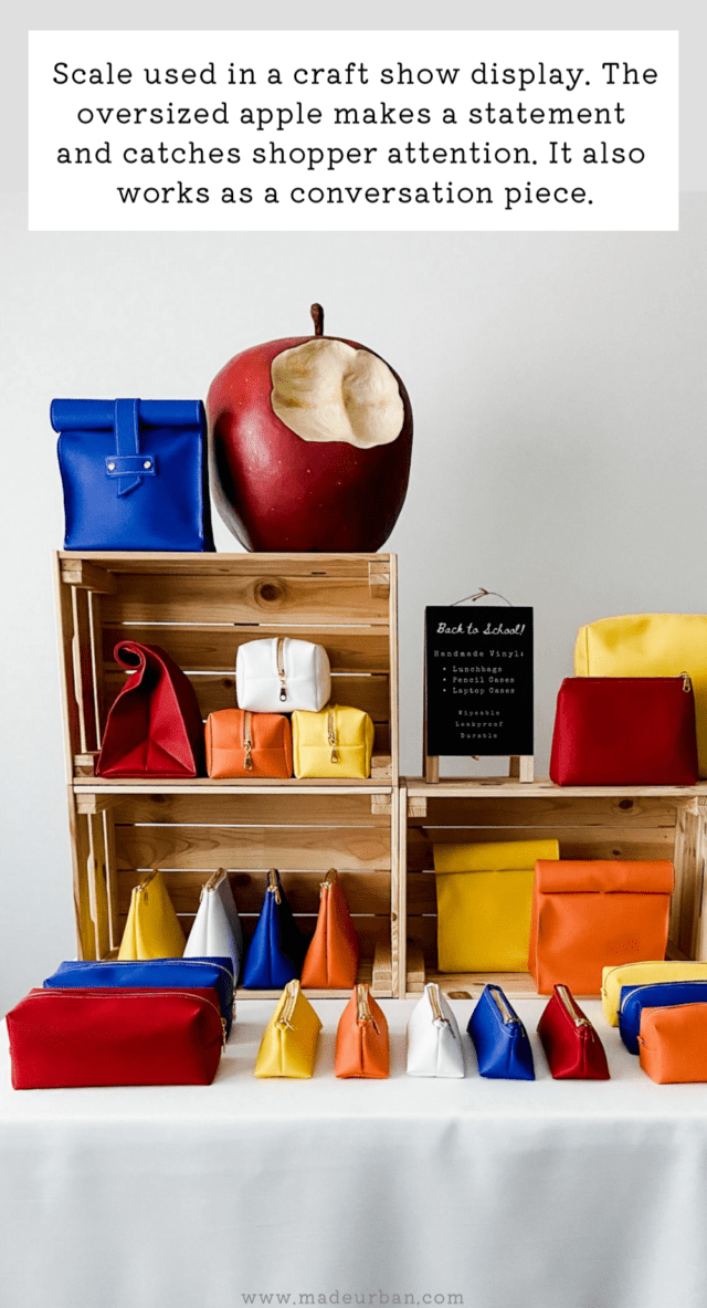
Adding larger-than-life elements can immediately grab a shopper’s attention. As they walk around the venue seeing everything in proportion, an oversized picture or prop will make them stop and take notice.
You don’t need to spend a lot of money either…you’re crafty! Cardboard, foam, paper mache, etc. can all be used to create lightweight, oversized objects that can hang above your table with the use of fishing wire. It will catch the eye of shoppers as soon as they walk into the venue.
Imagine a giant ball of yarn made from a styrofoam ball wrapped in rope and spray painted the same color found in a logo or product collection. Add a flat surface to the top and bottom and you have a cool display shelf for knitted goods.
Used in a craft show display
You can use a material like foamcore to create an oversized prop. This display uses a foamcore head cutout and an oversized scrunchie to make a bold statement.
Used in retail
How fun is this oversized pop can mimicking the print on the mannequin’s dress in a Moschino window? (Image source: VM)

Larger-than-life beauty tools draw attention to the makeup Kate Spade is selling inside. (Image source: VM)

Big props create color and interest through needles knitting a pattern at H&M and promote the knits they have in-store. (Image source: VM).

Hairpins are something that might be used with these Hermes scarves. (Image source: VM)

6 – CONTRAST
Using display elements that contrast product features can draw attention to the product features you want to highlight.
For example:
- Dark backgrounds are a contrast to light-colored products
- Rough textures in display fixtures can contrast the smooth finishes of products
- Large elements contrast small elements and can point out delicate features
You can also create a contrast to the surroundings. If the event is busy, bright, and loud, your quiet, serene setting will be quite the contrast to the event’s atmosphere.
If the weather is cold and snowy, a warm beach theme will also stand out in contrast.
Used in retail
The crisp, clean Alexander McQueen dress stands out in contrast to the dark background. (Image source: VM)

7 – HUMOR
Who doesn’t love to laugh? Humor helps us let our guards down and feel more comfortable…and a comfortable shopper is more likely to stick around and buy.
You don’t need shoppers to keel over in laughter; a simple smile or chuckle will immediately make them relax (and when shoppers are comfortable, they’re more likely to buy).
Be sure your humor is on-brand and doesn’t need explaining…keep it simple!
Used in a craft show display
Here’s a display by Don Fisher that uses humor. Their bags are fish-themed so the vendor has created a “fresh fish stand” and even dressed the part.

Used in retail
French Connection UK uses its F.C.U.K campaign to have some fun with phrases that will make you chuckle and maybe even shock you at first glance. (Image source: VM)

A giant whoopee cushion uses humor, scale and nostalgia to make you take notice of Fred Perry’s back to school children’s clothes. (Image source: VM)

8 – NOSTALGIA
Most people enjoy seeing something that reminds them of their childhood. It evokes a strong feeling, which is incredibly important when it comes to being memorable; do you remember products that made you feel nothing?
Items from our past, or “before and after” photos reminding us how far we’ve come, will encourage people to stop and have a closer look.
Consider your target market and the people, places, and things that were popular during their childhood.
For example, if I was selling adult lunch bags, I might find images of lunch snacks that were popular during my target market’s school days (e.g. fruit rollups, Lunchables, or the crackers and cheese dip that came in a pack with a red plastic stick for spreading). I could print those images to scale and glue them to foamcore so they could stand next to a lunch bag in my display.
Used in retail
This Moschino window brings us right back to playing dress-up with our Barbies. The oversized toy packaging grabs your attention and makes you envision how the bright and fun outfit will look on the mannequins…or you! (Image source: VM)

Theo Fennel’s window immediately reminds you of the sound and feel of spinning the tin-top that’s used as a prop, along with wooden blocks (spelling out Theo), both used to display beautiful jewelry. (Image source: VM)

9 – MOTION
Something moving among static products can catch a shopper’s eye.
You don’t want it to become a hazard or annoying (strobe lights are not the way to go), but something that makes people want to stop and watch a prop go through the whole motion, can work to your advantage.
The more complex the movement is, the further out of reach it should be (up high or behind your table). You don’t want moving objects to be in the way of products shoppers are trying to browse.
Movement can also be implied through displays to show off components of your products or to create a feeling. Pulling the end of a scarf up using fishing wire can imply the movement of wind and make the shopper think of chilly days.
Used in retail
This Anthropology window is so serene. Fans gently blow scarves to show how delicate they are while sunlight highlights the beautiful colors. (Image source: VM)

Movement is implied in this windy Hackett window, creating an interesting scene to stop and look at. (Image source: VM)

10 – SURPRISE
An element of surprise is involved in many of the ideas above but you can make an even bigger impact by creating a moment shoppers aren’t expecting at a craft show. It should leave them amused and excited to tell others about it.
You can also add intrigue. Make shoppers do a double-take and hang around a little longer to check something out or solve a puzzle.
For example, encouraging shoppers to come closer to peek into a shadow box or behind curtains to see what they’re missing out on. Having something out of place or missing intrigues the mind and forces it to figure out the missing piece of the puzzle or how to solve the equation, which gets shoppers hanging around a bit longer. Perhaps long enough for you to make a sale.
Used in retail
You may be surprised to see an island backdrop set up in the middle of the city for you to have your own photoshoot. And if you’re not quite camera-ready, it’s a great opportunity to head in and try some of Liz Earle’s beauty products. (Image source: VM)

A broken chair makes you take a second look as you walk past The Conran Shop, which is pointing out that their furniture is well-constructed and will last a lifetime. (Image source: VM)

Next Steps
If you need help putting several of these elements together, or making them work for your business and products, join the free email challenge:
5 DAYS TO A STANDOUT CRAFT SHOW DISPLAY
The lessons will walk you through how to stand out and tell a story through your craft show display so you can sell more product.
Over 30,000 people have taken the free email challenge. Below is a small sampling of the feedback it’s received:
“I am brand new at doing Craft Sales. I started in November 2017. Did my first sale sold nothing. Did my second sale and sold a couple of items. Took the 5 day challenge and made a profit at the last sale.”
~Just for you cards by Kathryn
“I applied some steps from the challenge and it was AMAZING, it really helped and improved my display. More people came to see the booth and many bought from me.”
~Beatriz, Owner of Pretelie from Brazil

CRAFT SHOW EXAMPLES
Try testing your new-found knowledge. Take a look at each photo, think about the visual merchandising techniques they have implemented and then read the caption.
EXAMPLE #1
Abagail from Our Blue Abode, sells beautiful home decor pieces and these are a few photos from craft shows she’s participated in. She clearly has a talent for creating compositions and photography. Please check out her website or follow @ourblueabode on Instagram

In these two displays, there are several well-implemented design techniques, but she’s focused on a few key ones:
- COLOR – colors used in her display are limited: cream, white, and green with a few touches of black. The colors have a very natural, earthy, and calming feel, which match her brand. The absence of color in her backdrop curtain, tablecloth, props, etc. allows the products to stand out. The neutral colors used in her display props (backdrop, tablecloth, props) create contrast between the dark rich color of the greenery.
- REPETITION – She’s limited her product selection, which naturally implements the “repetition” technique. You see the same circular shape repeated through the wreaths. The texture of the glass jars is also repeated, as well as the color of the greenery used in each product. Colors, shapes, and textures have created repetition.
- LINE & COMPOSITION – in the second photo, your eye is drawn to the highest object in the display; the wreath. It’s then drawn to the two lower wreaths. The greenery on the left side of the bottom wreath catches the eye and draws it to the grouping of glass candle holders on the stack of books (which creates a composition). The rolls of paper and eucalyptus stems create a line over to the second table composition. And the eucalyptus stem and candle in that composition create a line back up to the wreaths, so there’s this continuous loop (instead of the eye being drawn over to someone else’s table). It sounds complicated when you dissect a display into lines and compositions, but just as the eye is naturally drawn to red, without thinking about why, the eye does naturally follow a path. Properly using lines and composition helps keep shoppers’ eyes on your products.
Here’s another example of Our Blue Abode’s display at another event and an example of many visual merchandising techniques successfully implemented:

EXAMPLE #2
I have been admiring this company for years. I first noticed them because of their craft show display, I just think it’s so smart and creative.
Don Fisher was started by Julia Castaño (and her boyfriend helps where he can…like dressing up as Captain Don Fisher). Julia is a graphic designer based in Barcelona, Spain, and has studied branding and design. She started her business with fish-shaped pencil cases and now offers a wide variety of fish-themed bags. Check out their website and products; the details are amazing.
This is a photo from their first craft fair in 2013:

Here are a couple of photos from a more recent craft show, after a logo and brand update:

In these two displays, there are a lot of well-implemented display techniques but they’ve focused on:
- COLOR – the color scheme varies for each display. In the first craft fair display, they focused on pink, blue, and turquoise. The color of the wood is also repeated in signage, fish crates, business card holders, etc. The color palette in the first display evokes a fun, playful feel. They’re still having fun with their second craft fair display and letting their brand come through, but the colors used have a softer, more elegant feel to them.
- REPETITION – in both displays, the main colors are repeated throughout, as well as the wood & wooden crates are repeated. Their products and the way they’re grouped creates repetition through shapes and lines.
- LINE & COMPOSITION – in the first display, the lighting helps catch the eye at eye level. When the spotlights are on, they would help lead your eye down to the crates of fish-themed bags. But the big chalkboard sign also catches the eye, then leads the eye down to the bucket of fish and crates. Both displays use the angle of the crates and groupings of products to draw the eye down and from one product to the next.
- HUMOR / SURPRISE – both displays have a playful feel that would put a smile on any shopper’s face, and I’m sure Captain Don Fisher’s beard got a few chuckles that day. Their displays also add an element of surprise; who’s expecting to see a mock fish market in the middle of a craft show? They’ve even placed their fish bags on material that looks like ice…to keep them fresh of course. It’s such a fun idea that I bet every shopper stops at their booth.
EXAMPLE #3
When I was scrolling through Instagram, Poppiejanes‘ photo of their craft show display instantly caught my eye. Poppiejanes sells pillow covers that have a farmhouse vibe; many also have a “buffalo” theme, incorporating a buffalo shape or buffalo plaid. Check out their Etsy shop or Instagram feed for more amazing photos of their work and lots of inspiration for your home.

I wanted to point out how she’s successfully implemented these techniques throughout her display; even within a smaller section on her table. I also love the attention to detail shown in this close-up photo.
- COLOR – tan, cream and black create the base for this display and little pops of red and gold help lead your attention around the table. She’s kept this color palette consistent from her products to her props and display fixtures. It’s consistent right down to the twine used to attach tags and the bow around the base of the small spruce. This attention to detail creates a clean, cohesive look.
- REPETITION – this display is another great example of repetition, but just look at how many places it’s implemented. The burlap is repeated in the tablecloth and on the base of the spruce. The font on the pillows is repeated in her signage. I also want to draw attention to the placement of the repeated elements; red touches are perfectly spaced, and the darker tan pillow covers are broken up by the lighter tan and cream pillowcases, so they don’t blend into the tablecloth.
- LINE & COMPOSITION – the pillow sitting on top of the wooden crate, along with the small spruce tree, help grab attention, with the bigger pillows sitting on either side, drawing the eye down to the pillow covers sitting flat.
- LIGHTING – there’s a subtle touch of lighting in her display through the use of mini-lights inside the wooden crate. The mini-lights help to highlight the pillow inside and also create a bit of focus in the center of the composition.
Thanks for reading!
You’re so far ahead of the competition if you just took the time to read through those professional merchandising techniques.
If you want to learn more techniques to improve your craft show display, join the free email challenge: 5 DAYS TO A STANDOUT CRAFT SHOW DISPLAY
I’d love to hear your thoughts now…
Which standout display elements do you currently use at craft shows, and which are you going to try at your next event?
Reference: Visual Merchandising & Display (4th Edition) Martin M. Pegler

Hey, I’m Erin 



Wonderful post. I’m so tired of reading, “add color, go vertical” over and over again. I was in marketing before becoming a crafter and considered posting something similar to this. What the big boys (or girls) in retailing do and how you can do it too. Great.
Eu estou muito feliz por ter encontrado este site no Pinterest. As suas dicas são incríveis e me ajudarão muito na minha participação em feiras aqui no Brasil.
Thanks so much Carlie! I try to keep that in mind when writing all my articles. I don’t want someone spending their time reading the same information they’ve already read on another blog in different wording.
Great minds think alike There are lots of ideas that small businesses can borrow form the big boys & girls!
~Erin
Just getting started at shows…How can I make my table stand out? I custom make and sell unique wedding garters.
Hi Carol! Which techniques do you think you want to start with? Color, lighting, line & composition, scale, contrast, repetition, humour, nostalgia, motion or surprise?
Who doesn’t love surprises? I would love to send you pics of my last event table. I have another event in August. Soooo many thanks for your help!
I know you posted ages ago, but having a table with upside-down mannequin legs, pointing their toes into the air, with a garter on each leg would be repetition, and it would get MY attention!
Please do! You can email me at info@www.madeurban.com
~Erin
How do I make jewelry stand out???? So many people are making jewelry these days!
Hi Rebecca,
Jewelry is definitely one of the most popular categories to sell under. My advice is to always start with a unique product. What makes your jewelry different from the vendor across the aisle? That should be played up in your display. Here’s an article covering the topic https://www.madeurban.com/News/5_ways_to_make_your_handmade_jewelry_stand_out_eli/32
Next, work on building impactful collections, here’s an article covering that: https://www.madeurban.com/News/not_enough_vendors_use_this_powerful_method_when_c/6270
Once you have a niche product and strong collections, choose a theme that supports the collection you want to highlight (e.g. winter wonderland or love theme), props that communicate that theme (e.g. snowflakes or hearts) and a few elements covered in this article!
I was not able to download my purchase of your book. What do I do?
Hi Loretta,
Sorry about the trouble you’re having downloading the ebook. Could you please email me at info@www.madeurban.com so I can get some more details?
Thanks so much,
Erin
I’ll be doing my first craft show this November (I sell handmade cards). I have no idea how I should set up my table, but hopefully these tips will help!
I just signed up to do my first craft show in November! I sell personalized drinkware, glitter items. I was thinking of using my logo colors (gold and tiffany blue/mint) in my display!
Love your photos/displays on how to make your products stand out at a craft show or show room. Great!!! Would love to order magazine. Keep up the great work.
~Good luck on your first craft fair Lisa!
~Using your logo colors is a great way to add branding to your booth and create a cohesive look!
~Hi Pat! The photos are actually taken from this blog: hmvm.co.uk
She gave me permission to use her lovely pics of store windows to explain my points.
Feel free to come take Photos at the Valley Country Fair in Valley Crucis NC…I’m proficient in city design Windows but would like to up my wow factor at shows
I sew for a living and most of my work has been costuming, selling through custom orders. How do I best present myself at a comicon or craft show?
Hi Chris,
That’s a great question. I cover the topic of selling customized work at craft fairs in this article: https://www.madeurban.com/News/how_to_sell_at_a_craft_fair_when_your_products_req/6261
Sometimes selling personalized / customized product at an event can seem a bit trickier but you do get more space to have fun with your display.
An idea you might want to consider is choosing a theme for your display based on few examples of costumes you can make. Implement some display elements covered above and turn your space into a new world.
For example, if you make superhero costumes, create a booth that feels like the scene from a movie when they’re fighting crime. Put a few of your costumes on bust forms throughout the space and set up a table where customers can flip through albums of your work, look at options and place orders.
Hope that helps!
~Erin
Great ideas! Thanks Erin!!
Great article! I’ve been selling at craft shows for almost four years and haven’t ever seen an article cover this topic so well! I sell hand-painted canvases and chalkboards. Any display tips for those items? -Henri, St. Louis MO
I am a new start up business selling salt and sugar scrubs (eventually I move to bath bombs, etc). I am having problems setting up a website that is easy for me to use, what would you recommend (free one I prefer)? Currently I am using Wix.com to do so but I don’t have a lot of product yet as it is made to order.
I was asked to participate in a Craft and Vendor Fair 11-25 & 11-26-16 and I am worried as I don’t make a whole lot of money and I want my booth to look great not just thrown together. Please help with ideas. I currently have old barn wood, pallets (not disassembled) and old porch post. I love the vintage look, what else could I do?
Thanks;
Angela
Hi Henri,
Thanks so much for reading! I like to start with the setting and once you determine that, you can implement a few elements above. To determine a setting, think about who might buy your signs and where they would display them.
For example, if you make chalkboard signs for kids’ birthday parties, you may create a birthday party setting to show people how the signs may be hung or displayed. Then incorporate a few elements from above into your display, such as: color (create a blue and pink display to signify a girl’s or boy’s party), nostalgia (add a couple props that remind parents of their birthday parties and the games they may have played) and surprise (a birthday table with balloons and streamers would seem out of place at a craft fair and catch a shopper’s attention).
If your signs are for men and to be hung in a living room with a rustic vibe, set up a man cave in your space and use colors/materials/props/etc that communicate “rustic”.
Hope that helps!
Erin
Personally, I don’t think the use of window displays shows you get the struggles people have with craft show displays.
A craft show vendor has a very small space that needs to be advertising, merchandising, stock, shoppers, and point of sale. Thanks to layout of the shows most customers don’t see the booth until it’s from a short distance. There are also show restrictions on displays limiting height or things too near the floor which will change from event to event. And, ultimately the display needs to be able to be portable and sturdy enough to be set up quickly, then broken down and transported in a car.
High fashion window displays are inspiring, but the realities of the two are different enough that using them for examples is off base.
You have a wonderful eye to what makes a window successful, and I did enjoy seeing them. I would love for you to look at real world examples of craft show (indoor and outdoor), artists booths, what they are doing well, and how they set them up.
Finally an article sharing new ideas. I’ve signed up for a craft fair in the spring and want to try something new with my jewelry display. Any ideas?????
Great Article.
Hi Haley – I’ve actually written an entire article on displaying jewelry at a craft fair and applying these techniques Check it out here: https://www.madeurban.com/News/how_to_display_jewelry_at_a_craft_fair/6283
Thanks James, glad you enjoyed it!
Hi Mellie – Thanks for reading! As mentioned, the purpose of this article is to get readers thinking outside the box and to spark ideas. Techniques used in retail visual merchandising are key to creating a display that attracts shoppers and makes sales, it just takes a little imagination to apply them to a craft fair booth (And is also covered for each technique under “How to use it at a craft show”). There are several other articles on our site as well as an ebook MAKE MORE MONEY AT CRAFT FAIRS: https://www.madeurban.com/Make-More-Money-at-Craft-Fairs/
if you’re looking for “real world examples”.
Hey there!
I really enjoyed this article. I am selling gourmet jams and jellies. Do you have any suggestions on how to present this?
Thank you so much!
Heather
Hi Heather!
So happy you enjoyed it! I would suggest having a read over this article: https://www.madeurban.com/News/how_to_display_jewelry_at_a_craft_fair/6283
Even though it’s for jewelry, I go into much more detail about how to come up with an idea and implement the techniques mentioned above. And I use a food type setting for my example so you might get some ideas
Start with the message you want to send and the setting you want to create. What makes your jams gourmet? What communicates “gourmet” and what would people expect if they were told they were being served something gourmet? It may be silver platters, polished silverware, mood lighting and clean presentation.
You can use that as the starting point and then implement points mentioned above such as repeating props or the pyramid formation your jams are displayed in for each flavor. Carrying the color found in your labels throughout the space in your signage, tablecloth and props.
Hope that helps!
~Erin
Hey Erin!
Thank you so much! I really appreciate. Sometimes we get too close to what we’re doing and need to step back and look at it from another perspective. So thank you so much for your perspection. I did buy your ebook and started it today! I’m loving it so far!
Thanks again and best of luck!
Heather
Omgosh I loved reading this page. I need some major major help with my personal business card coming up with a catchy name and logo.
I teach chalk painting refurbishing furniture. The only thing I could come up with is THE CHALK painting Chic. Life is what you paint it? anyone can help me please my email is onemiamia@hotmail.com
Hey Mia,
What about CHALK IT UP? I do like life is what you paint it. You could also think along the lines of something to include… erasable, changeable/change, moments in time… for the tag line using them in some part or another. Something like “changing the way you see furniture”. So that way it’s dual purpose. Changing meaning refurbished and the sole purpose of a chalkboard in general.. to erase and change.
Good luck!
Heather
Thanks so much for your support Heather! I hope you love the rest of my ebook Let me know if you have any other questions along the way. I also love your suggestion for Mia (CHALK IT UP), good idea!
Okay. This article is so helpful and exactly the direction I needed. I sell fabric scarves….any suggestions?
I just read this informative and wonderful article. I hope you are still responding to this. I have been doing shows and fairs for over 10 years selling my faux fur, handmade throws, baby blankets, women’s scarves, etc. I tried to make it look cohesive but this seems so professional and I want to do this but cannot for the life of me pick a direction or a theme. Obviously comfort is the number one idea but??
Hi Carol, glad you like it You may want to check out this article: https://www.madeurban.com/blog/how_to_display_jewelry_at_a_craft_fair/6283/ to brainstorm the start of your display and determine your message (sounds like “comfy” is yours) and the setting (where people will use your products).
Depends on space but it may be fun to create a nursery scene (or living room) Add a couple props like a crib to show your blanket draped over the side, a rocking chair with another cozy throw and if you have a smaller space, forgo a regular craft fair table and replace it with a comfy chair and small dresser. Your best selling throw could be draped over the chair and people can sit down and feel how comfy & warm it is. Display variations on the dresser (tier the drawers open and display more stock IN the dresser). Repeat colors by displaying color collections, add lighting with a cozy lamp and surprise is build in as people won’t be expecting a room setup at a craft fair
~Erin
Hi Katrina, thanks for reading! What’s the theme of your scarfs? What type of message do you want to send to your shoppers? What type of setting do you imagine them being worn in? They may be dressy, casual, to go with a winter coat or in the summer with a t-shirt. Start there to communicate the setting and then add a few elements from above. Use a color from one of your scarf collections in the rest of your space to make a strong statement, create an oversized prop, etc.
I sell sunglasses. Any ideas on how to set up my booth at festivals. Usually a 10 x 10 booth or 10 x20? Thanks
I love all your posts! They’re so great! I sell wooden decor signs. because they’re so bulky it’s hard to come up with a good setup when it’s just a table and not a booth. Any ideas?
Hey Ricky and Megan!
Thanks so much for reading. I’ve just created a free 5 day challenge which will walk you through coming up with a concept for your display, based on your brand, your ideal customer and your products.
If you sign up for that, you can directly email me with any questions along the way.
You can sign up for the challenge here: https://app.convertkit.com/landing_pages/168295?v=6
Erin
Any thoughts on displaying blankets and other large, flat, floppy items? I make playmats for babies and mermaid tail blankets, both of which I have found challenging to display in my space. The shows I do give each vendor an 8ft table with no room in front or on the sides, and very very little space behind (only enough room for chairs). I have tried a garment rack behind the table, folded on the table, a small gridwall behind the table, and a tabletop garment rack, and sales have been ok, but nothing has felt “right.” Here’s a picture of the display with the partial gridwall – https://www.instagram.com/p/BLBVA5MAoCs/?taken-by=snugglestudio15
Hi Marly, thanks for sharing a link to your display!
My suggestion would be to use enlarged signage to display your blankets as opposed to displaying the actual blanket. It would be important to have professional photos of your products in use with great lighting. Have your best seller the largest photo (almost life-size), then perhaps the shark slightly smaller and the mermaid the smallest. Also think about use of color in the photos; perhaps showing pink or blue in each photo.
You could use smaller signage (postcard size) for variations so shoppers don’t need to unfold each blanket. Try rolling the blankets on the left and placing in baskets to create some separation on your table (https://www.pinterest.com/pin/553028029229963995/). For example, if you offer a bear, fox and owl blanket. One basket would show a photo of the bear blanket and inside the basket would be the different colors of bear blankets you offer. Repeat with fox and owl.
Let me know if that sparks some ideas
Hi Erin, we (my sister and a friend) are doing our first fair Easter weekend. We sell handbags, the kind you’d have for a wedding, vintage bunting made from old embroidered tablecloths, tray cloths etc. Knitted baby clothes from vintage patterns and handmade dresses, rompers, dungarees and christening gowns also from vintage patterns that we have been given. Would you agree that we should keep the theme on our table as white/cream so that our goods will stand out? I’ve taken on board your oversized display and had thought of putting an applique on the white cloth of a huge vintage sewing machine with our name on.
Hi Lynn, thanks for reading!
It sounds like you’ll be selling a wide variety of product (which can get a little tricky). My first suggestion would be to decide on your message. A wide variety of product can work but there should be one clear message (sounds like it may be vintage items).
Then work your theme around that message.
If vintage style products is your message a white/cream tablecloth and display fixtures/props could look amazing.
When people scan the room, if your products and display are all light colored, they’ll see a block of white/cream which does give off a vintage vibe and will help you stand out from other tables. I also like your idea of the oversized vintage sewing machine
If you have other questions, or want more direction on finding your message you can sign up for the free challenge, which will also give you access to email me directly: https://app.convertkit.com/landing_pages/168771?v=6
Erin
Hi Erin, my daughter (13) is doing her first children’s fair and she has a hard time coming up with a logo and a name. She makes string art pictures. Also someone suggested to her to sell more than just one type of craft, maybe jewelry. Do you have any suggestions what else should she make/sell if any? Also any ideas as to name, logo and display would be very welcome. Thanks!
Hi Heidi,
Thanks for commenting! I’ve got to be honest, names are not my forte I’ve had a hard time coming up with one for each of my businesses but if you Google “Business Naming Tools” there are some handy websites that may help you.
When it comes to selling jewelry, that’s definitely something she could try her hand at and see which path she enjoys more.
I personally always advise handmade business owners to choose one type of product to sell and perfect it to avoid spreading themselves too thin. But it’s always up to the vendor and there’s no harm in trying different things; especially when she’s young, creative and just starting out.
I’ve recently written an article that may spark a few ideas if you’re looking to add variety: https://www.madeurban.com/blog/want_to_stand_out_at_a_craft_show_try_these_displa/
Hope that helps!
Erin
I’ve never commented on stuff like this before but wow, every single topic you wrote about inspired me and sparked great ideas for my booth this Sunday. I think I might overdo it this weekend hahaha oh well. Go big or go home lmao. THANK YOU <3
Hey Aron,
That’s so great to hear! Keep us updated on what you try and your results
Erin
Am selling handmade cards. Birthdays, Christmas and Friendship s. Not sure how to set it up to gather traffic and sales.
I sell One of kind Fantasy Baby Dolls at Vintage Doll and Bear Shows and Pop Culture Conventions. Thank you for providing the tools for me to see that I need to market both of my booths very differently, instead of going mad trying to make one suit both shoppers.
Hi
I sell handcrafted cards and would welcome any ideas on how to display my card stock in a unique and professional way. I currently use baskets but in the past have used plate holders but have found that they blow over in windy weather . I have tried to find some weighted card holders but have not been successful in this. Do you have any pictures of craft displays that are selling cards that I can get any ideas from in terms of the look of my stall. I often set up my stall and feel that it could be presented better and i seem to end up just making do with how it looks. I am sure that I could increase my sales and the shopping experience for shoppers visiting my stall, as well as increase my feeling of a sense of a job well done. I would welcome any tips, information on where to purchase display equipment as well as stall/display pictures so that i can get some ideas. Thanks Regards Careen
Do you have any artcles on outdoor craft shows?
Hi P.jackson, I sure do! Here are a few articles on the topic of outdoor markets:
https://www.madeurban.com/blog/how-attract-shoppers-market-booth/
https://www.madeurban.com/blog/how_to_prepare_for_an_outdoor_market_-_organizers/
https://www.madeurban.com/blog/tips-buying-vendor-tent-outdoor-markets/
Hey Careen & Margaret, here are a few ideas for card display that would help them from blowing over in the wind:
https://www.pinterest.ca/pin/224546731401001112/
https://www.pinterest.ca/pin/575897871083388513/
https://www.pinterest.ca/pin/339599628142387618/
And thanks for reading Cassandra! Glad you found the article helpful
Hope that helps!
Erin
Hi Erin,
I really enjoyed your article. I’m doing my first craft sale in the beginning of October. Then I’m doing one on the 28th of October, and the last one on November 16th. The first sale is more fall season stuff, the second one is Hallowe’en themed, and the third one is Christmas themed. I make one of a kind wreaths and painted signs, in Fall/Halloween and Christmas themes. My focus is on nostalgia. I use new, repurposed and vintage materials. My signature crafts are burlap wreaths, blingy witch hats and hand painted barn wood signs for Fall/ Hallowe’en. My Christmas crafts focus on vintage figure skates as wreaths, refurbished wooden sleds For porch decor. I’m having trouble with naming . I have “ Robyn’s nest”, and that’s it. Any suggestions? Also I’m using wooden crates and a couple of metal stands for wreaths. How to group or display them?
Thanks so much!
Robyn
Hello Erin, I’ve done craft shows in my home and did very well but that was 20 years ago. I’m 80 years old now and I’m going to do one in a church gym. I’m making baby items, bibs, binkey clips, burp cloths, baby blankets, hair bows and head bands. Do you have any ideas how to display them. I have 2 A frames and an 8 foot table. Nothing can be on the floor. For a name I thought maybe “SUGAR & SPICE” would it be too much to put “& EVERYTHING NICE”?
Hey Erin, my first craft show is in March, and I’ve just started thinking about my display!!! Do you think you could help me brainstorm ideas? I sell things for small kids and babies, like burp rags, bibs, flower hair clips, headbands, cute messenger bags and totes, pacifier clips, zipper pouches, diaper covers, etc., and I use bright colors in my products. I kind of want to use contrast and lighting. I was thinking string lights? Any other ideas? Thanks so much!!
I’m doing my first craft show this May, 2019. I;m a stampin Up Demostrater. SO I sell homemade greeting cards, candy crafts, Etc. I want some great ideas to set up to sell and do really well at this. I would love to get a lot of customers to join my card making classes at my house or take them some where else.
I’ve been reading your advice (and buying books) and used it to create a unique display for my pet beds – and a few other things. I just had my first show, and got more than one complement on my set up. It was fun watching what people looked at and in what order. And yes, I made money I have another show next week.
Thanks!
I sew and design custom handmade purses and keep an inventory for craft shows. I already implement most of these ideas but I have a hard time convincing my husband that I need to UP my decor and entrance. I have beautiful drapes/scarf for the entrance and curtains for a backdrop, but I always chicken out on using them. Don’t want to show up the other vendors around me, but I’m a fancy frilly girl at heart. My table covers are lavender, all my drapery is shades of lavender, and all display items are flat black. I also hang a lavender chandelier from the center. I also have a handpainted sign I display outside my tent that says what I do. Please convince that I need to hang the drapery no matter what. I bring it everytime and lose my nerve, help.
This is all superb advice and fantastic suggestions. Thank you so much
Caroline – The Bright Beetle
Hello,
I read all your articles and have purchased some of your materials. You are so helpful and I appreciate all your support.
My question is about using different colors. I was always told to stay with your logo/brand colors in display and table cloth.
So confusing to know which way to go with the color theory.
I would like to do applicable colors for the seasonal shows .
Any clarification here would be helpful.
Thank you