12 Retail Tricks to Boost Craft Show Sales
I believe in using ethical sales tactics. Tricking or pressuring people into a purchase they might later regret isn’t a good way to grow a business.
However, you are running a business and for a business to stay in business, it must sell its products or services.
So these are some of the techniques that big retailers use that are subtle and simply nudge (rather than pressure) people to buy.
Try these strategies at a craft show to boost your sales.
1 – Eye level is buy level
“Eye level is buy level” is a popular adage that reminds retailers to put the products they want to sell at eye level.
Adding products at eye level to your craft show display will ensure you’re taking advantage of vertical space and creating a display that can grab shoppers’ attention from across the room.
Be mindful of which products you want to sell the most of at a craft show, and place them in your eye-level spots.
Those products might be:
- seasonal
- on-trend
- higher profit margins
- best sellers
- etc.
Just below eye level is “touch level”. Place products here that you want your customers to touch, try on, smell, etc.
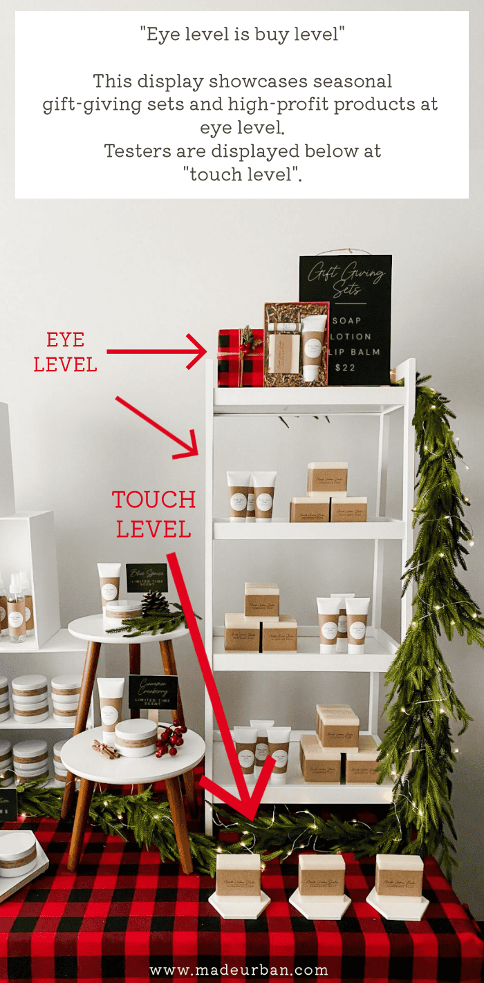
Also, consider a product’s target market. If you sell products for children, keeping them lower in your display will encourage them to touch…and tell their parents they want it 😉
“Stretch level” (above eye level) and “stoop level” (below touch level) should be used sparingly at a craft show.
You may add “display only” elements, extra stock, or lighter items at stretch level. Extra stock and/or heavier items can be placed at stoop level.
2 – Encourage touching
Research shows that a consumer’s willingness to spend more on an item increases as they spend more time looking at and touching it (source).
Vendors selling items such as candles and soap should display “testers” and use signage that clearly communicates it’s okay to touch/open/try/etc.
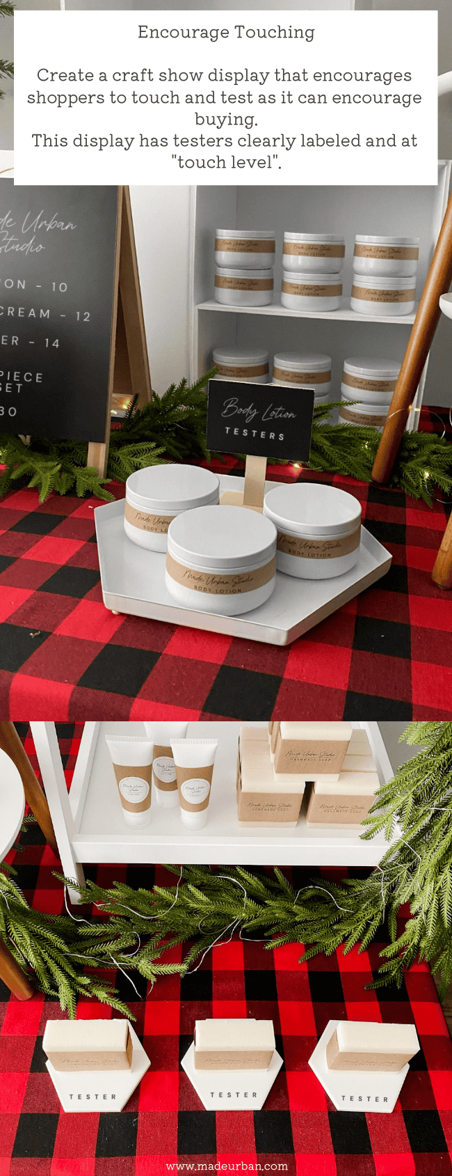
Even if you’re selling an item such as jewelry or bags, encourage shoppers to touch, try on, etc.
You may do so through your sales tactics (e.g. “Please, don’t be afraid to pick up anything you like”) or through display elements.
For example, a jewelry vendor may add several mirrors to their display, which signifies to shoppers that they should try items on.
Don’t make your display too fragile.
If shoppers think something might fall over, they won’t touch it.
Piling or stacking items can also deter touching. If shoppers must move 10 items to get to the one they want to see, they may not bother.
3 – Scarcity effect
As you probably know, I’m not a fan of cramming as much product as possible onto a craft show table, and the scarcity effect is one of the reasons why.
I explained in this article how displaying too many of one product can lower the perceived value of it.
It also doesn’t create any urgency to buy.
If you’ve made 20 of your most popular product, consider keeping the majority of your stock in it under your table, then restocking as it sells.
Most craft show shoppers have a limited amount of money they’re willing to spend that day.
If you have lots of stock left in an item they love and another vendor only has a few, they’ll choose to buy from your competitor that day. Because your item doesn’t appear to have the risk of selling out, they can just buy from you in the future (if they remember to).
Encourage shoppers to buy from you at the craft show by creating a little urgency with the appearance of limited stock.
You don’t want to trick people into thinking it’s your “last one” when you have dozens more behind the table. But there’s nothing wrong with making an item feel a little more special and coveted by altering the way you display it (i.e. only putting out a few).
4 – Limited-time offers
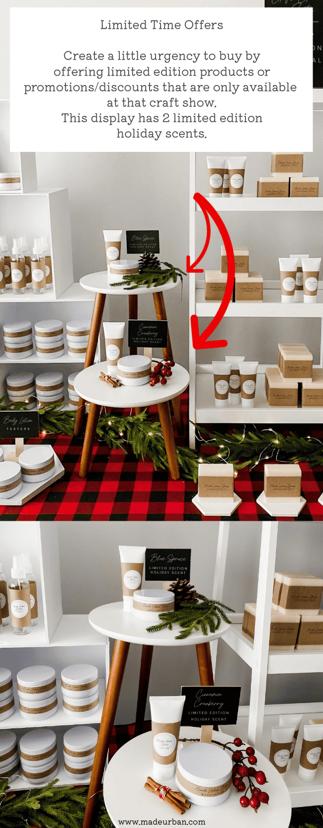
Creating a product or deal that’s limited to the craft show you’re at can also create a little more urgency to buy.
You may create a limited edition product for a craft show and once it’s gone, it’s gone; you’re not making more.
Or you may run a promotion for a craft show and offer a discount that day only.
Be sure to communicate your limited-time products/deals through signage.
5 – Goldilocks pricing
Offering different levels of pricing ensures each segment of your target market can find something that fits their budget.
Generally, “goldilocks pricing” is “good-better-best” versions of a product (i.e. lower to higher quality of materials/ingredients/features/etc.)
However, you can create your tiers of pricing in a variety of ways.
You may offer:
- products in different sizes (e.g. skincare products offered in travel size, small size, and regular size)
- different types of products (e.g. lip balm, hand soap, facial cleanser)
- bundles of products (e.g. cleanser, cleanser and lotion sold together, cleanser, lotion, and toner sold together)
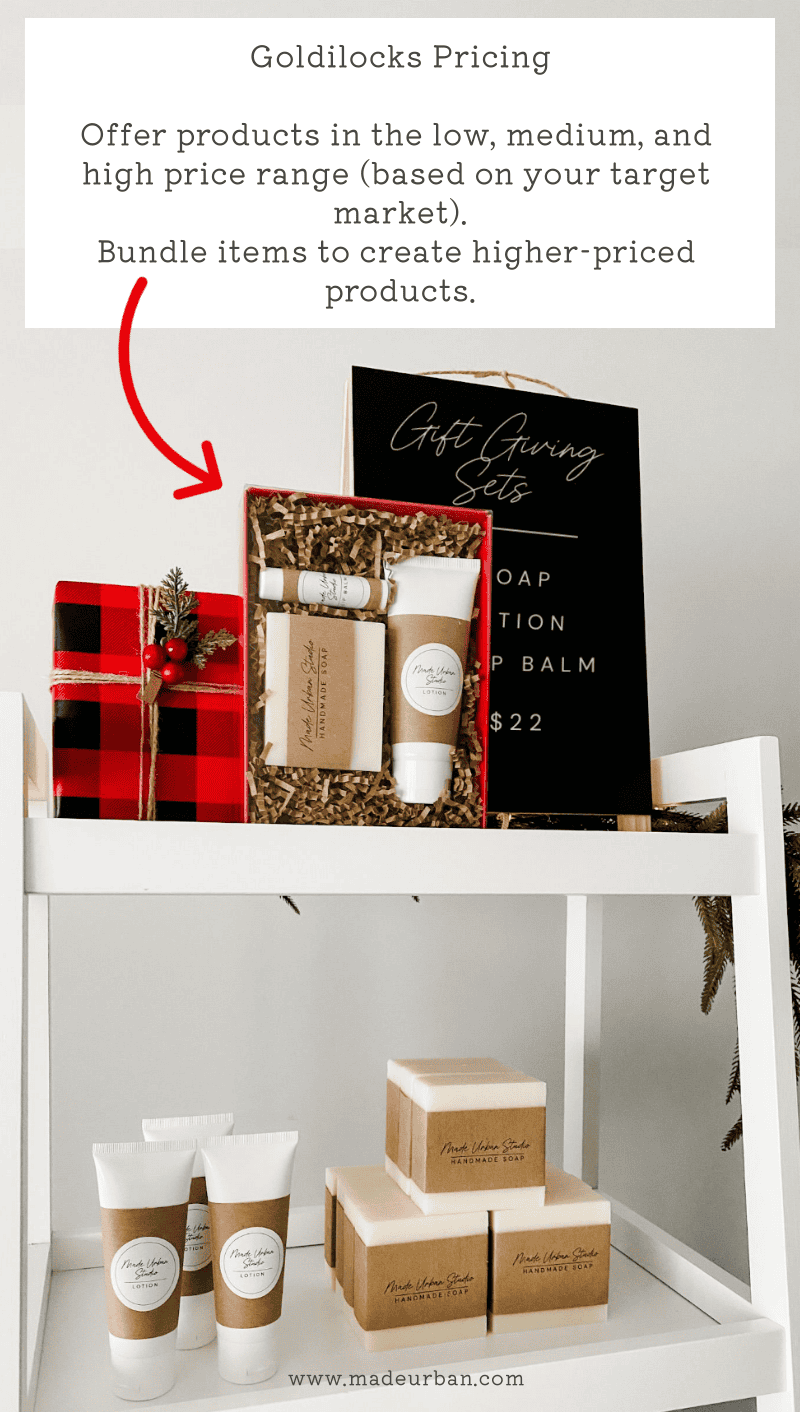
Offering 3 levels of prices (low, medium, and high), and using signage to clearly communicate you have something for a variety of budgets, will help ensure you capture more sales.
Low, medium, and high pricing will be defined by your target market. For a luxury brand, a low price may be $50. For another business “low” may be $5.
6 – Pricing psychology
There are a couple of other tiny pricing tricks that have been studied (source) and proven effective.
Dropping the dollar sign can encourage people to spend more (source). For example, instead of pricing an item as “$25”, you would write the price as “25”.
The other change to prices that can encourage more people to buy is setting your prices to end with a “9”.
For example, more people purchased when an item was priced at $4.99 than when it was priced at $5.00. The same applied to a dress priced at $49 versus $44; more people purchased the $49 dress.
7 – Loss leaders
This one should be used sparingly as a small handmade business, however, you may consider selling a product at a price that doesn’t give you much profit but is irresistible to shoppers.
Generally, low prices should not be the focus of a craft show display. But an in-demand product at a low price may help draw more shoppers to your booth.
Once there, you have the opportunity to sell your higher-priced/higher-profit products.
Here are 6 ways a craft business can create a loss leader: 6 Ways To Use a Loss Leader to Make More Money
8 – Breathing room
Many retailers try to make their stores feel spacious to encourage shoppers to hang around longer (source).
Although some people will put up with cramped shopping conditions to get a good deal (a handmade business shouldn’t be targeting bargain shoppers), most won’t stay in a crowded space very long.
If you have a 10’ x 10’ booth, try to limit how many fixtures you use so there’s room for people to move around.
Whether you have a booth or a table, be mindful of how much product you put on the table and the spacing you leave between products and fixtures.
Too much product in a space can make it feel cramped and you’ll have shoppers reaching over one another to get to items.
Leave negative space between products or product groupings for visual and physical breathing room.
>> Here’s why your display should have negative space and how to add it.
9 – Essentials in the back
If grocery stores put the essential items most shoppers buy right at the front of the store, people could quickly grab what they need, check out, and leave.
They wouldn’t be tempted by the freshly baked bread, freezers full of ice cream, or shelves full of chips.
This is why items such as milk are placed at the back of the store (source).
This technique is best used in a booth but can be strategically applied to a table as well.
If you have an essential item or best seller, place it near the back of your display.
Then shoppers must enter your booth and walk past your other items, to get to the one item they “need” or want to see.
In a smaller space, you may place your “essentials” at the top and back of your display.
Let’s say I sell soap and my mini bath bomb sets always fly off the shelf during the holidays. I would place that near the back of my table and higher up. Still within reach, but shoppers are more likely to scan the items in front and below my bath bomb sets than if they were displayed on the front corner of my table.
10 – Scent and sound marketing
One study found that in an appliance store, the smell of apple pie boosted the sales of ovens and fridges. While German and French music boosted the sale of particular wines in a liquor store (source).
Think about a scent or sound that your target market might connect to your product and consider adding it to your space.
For example, the relaxing sound of waves lapping might encourage more sales of relaxing bath bombs or beach-themed products.
The smell of coffee might encourage people to pick up a new mug from a pottery vendor.
11 – Checkout temptations
If you’ve been a reader of mine for a while, you’re familiar with this technique already, however, it’s worth mentioning again.
When you’re standing in line waiting for other customers to pay, or you’re waiting for the cashier to ring your items through, you’re often tempted by small items displayed on or near the checkout counter.
>> At a grocery store those items might be magazines, gum, or candy bars.
>> At a clothing store, checkout items might be jewelry, perfume, or lip balms.
>> At a shoe store, add-on items might be shoelaces, shoe protectors, or shoe cleaners.
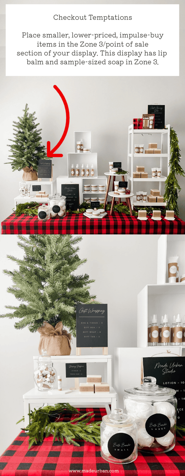
Be sure your craft show table has a zone 3 and fill it with smaller, lower-priced, impulse-buy items.
Here’s more on setting up a zone 3/point of sale section in your display: How to Add a Point of Sale Section to your Craft Show Display
12 – Speedy checkout
When I was the regional visual merchandiser for a major retailer, being a cashier wasn’t technically my responsibility, but I was trained on how to use the checkout tills so I could, on occasion, jump behind the counter.
That’s because they had a rule: If there were more than 2 people in line, someone needed to open another till.
The faster they were able to ring people through, the more money they could make per hour.
A retailer isn’t making money when someone is standing in line (they’re not paying and they’re not shopping to add more items to their basket).
Although you may not have long lineups at a craft show, you want to get as many shoppers as possible flowing through your space. And when you have too many people around your table or in your booth, it prevents others from stopping.
A lineup is a deterrent for most shoppers.
How many times have you been on the fence about buying something and then decided not to because the checkout line was too long? (Or the wait for a change room was long, or you couldn’t find someone to help you.)
Consumers don’t like waiting.
Streamline your checkout process and prep your checkout materials so it’s quick and easy to complete transactions.
During busier shopping seasons (like Christmas), consider bringing a helper so they can help you clear lines faster.
As mentioned earlier, it’s important to have a zone 3 that’s set up for checkout. You don’t want people standing in front of your best-selling items waiting to pay and blocking others from shopping them.
Move them down to your zone 3 where they can shop your “checkout temptations” and be out of other shoppers’ way while you ring their purchase through.
>> Here’s how to create zones in your display: Craft Show Table Layout Tips
Let me know which tricks you’re going to try at your next craft show!

Hey, I’m Erin 🙂 I write about small business and craft show techniques I’ve learned from being a small business owner for almost 2 decades, selling at dozens of craft shows, and earning a diploma in Visual Communication Design. I hope you find my advice helpful!
