3 Quick & Easy Craft Show Display Tricks to Stand Out
If you have a craft show quickly approaching, you need display tricks that are quick and easy to implement now.
So I’m sharing a few of the most impactful display tricks I learned through my visual design & communication education.
These are also the top techniques I applied when working as a Visual Merchandiser for major retailers.
They’re tips that can be implemented last minute, requiring very little time or money.
When you’re ready to invest more time into your craft show display, check out the free 5-day email challenge: 5 Days to a Standout Craft Show Display.
#1 – One dominant color
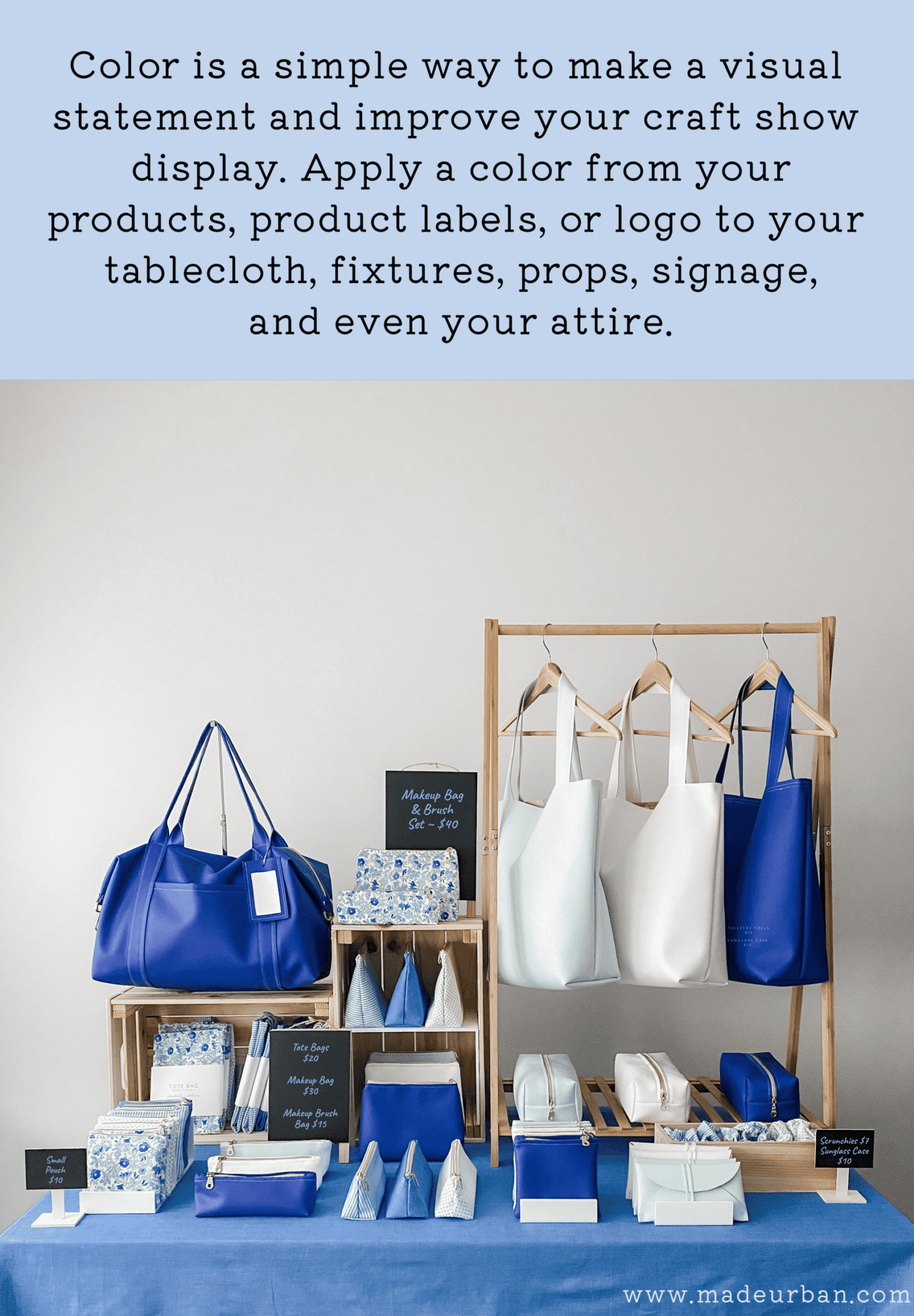
Color is THE easiest way to make an instant impact. It’s also a great way to communicate a feeling or help tell a story.
Imagine the typical window displays you see when walking through the mall.
Now imagine a window display that is drenched in red.
>> The backdrop and floor are red.
>> The props are red
>> The mannequins are wearing red outfits
>> The mannequins have red hair and are wearing red lipstick
>> Maybe even the lights have a red filter on them
That window would catch your eye no matter who you are or what you’re shopping for.
Depending on the store, props used, style of clothes, time of year, etc. the red would also help communicate a feeling or tell a story.
For example, if it’s the beginning of February and a women’s clothing store has a red window display with mannequins wearing elegant silk and velvet dresses, shoppers would get a romantic vibe from the display. It may get shoppers imagining a romantic night out for Valentine’s Day.
Color is the easiest way to catch a shopper’s eye.
The fewer colors you use in your display, the more impact you’ll be able to make.
How to apply
Start with a color theme that will match or contrast your products and that you can apply to your tablecloth, fixtures, signage, props, and/or attire.
For example, if my products are blue, I can apply blue to my display elements. Or, I may choose a contrasting color, such as orange, to make my blue products pop.
If your products don’t have a lot of color, pull a color from a product label, your logo, or based on a feeling you want to evoke.
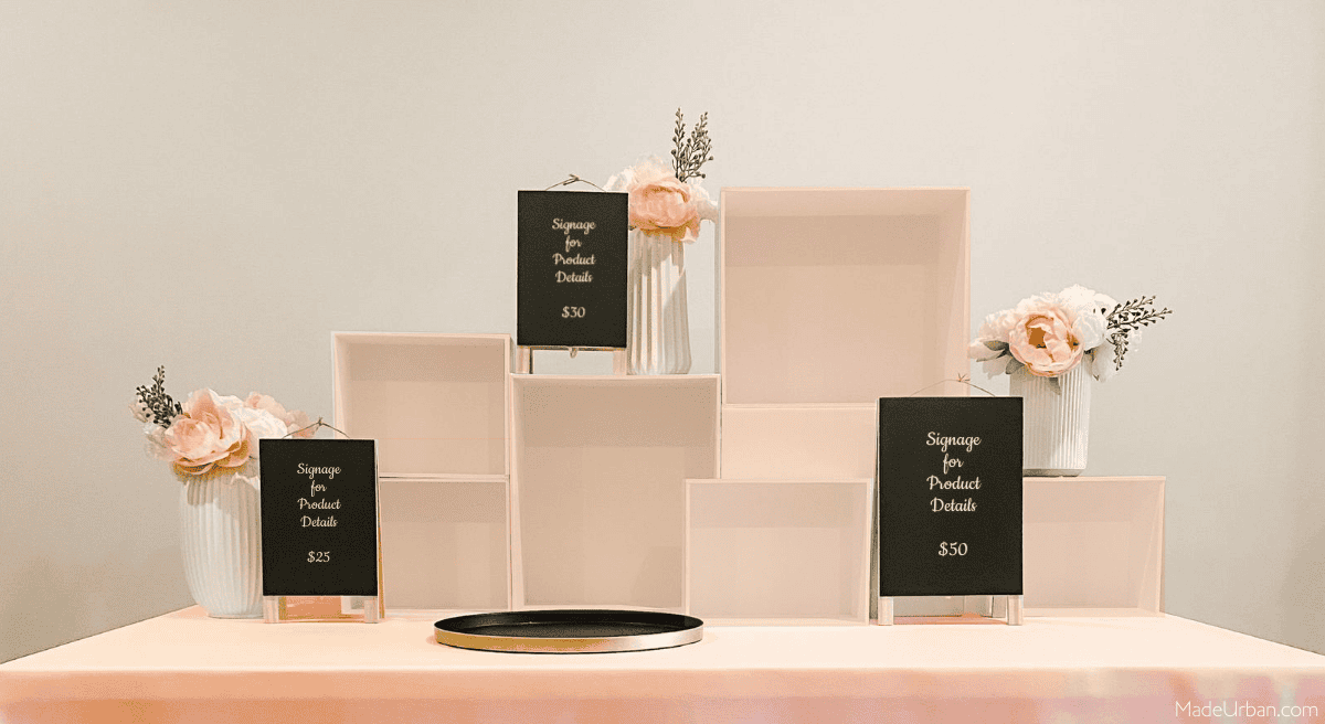
For example, a line of candles may have white wax and white and black labels. If the scents are floral, a soft pink could be used for display elements to help communicate the feminine scents. A pink tablecloth, pink display fixtures and pink flowers add a feminine feel.
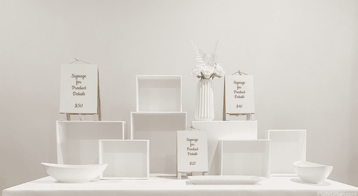
Alternatively, you can lean into a lack of color and create a striking all-white display. Here’s an example of white tablecloth, props, and fixtures. Insert a white product and it creates an eye-catching display.
More than one color can be present in your display, but ONE color should be the most dominant.
For example:
If Halloween is coming up and I’m selling soy candles, I may choose orange as my color. Orange won’t clash with the white candles, and black can be used as an accent where orange isn’t appropriate (e.g. text signage). Orange might signify Halloween or fall during September/October.
If I sell soaps and they’re a variety of colors, I may choose a neutral color for my display, based on my message or my brand. For example, if my soaps are made with goat’s milk, white or cream would be a good color. If my soaps focus on natural and organic ingredients, I may choose beige as my color.
Let’s say I’m selling art prints and they follow a flower/plant theme. Green would be a good display color. The green may not complement every color present in my art, but it will communicate a “botanical” message.
You can apply your chosen color to one or more display elements:
- Tablecloth – if you can’t find a tablecloth to match your color, you can dye a white tablecloth. Other options are to buy a few yards of fabric and make a tablecloth. If you don’t sew, you can use iron-on seam tape to iron the edges in place. Shower curtains or bed sheets may also be an option.
- Fixtures – if you’re using items such as crates, boxes, bowls, trays, etc. you can spraypaint them in your chosen color. I created the risers shown in the photo above out of foamcore. It’s a simple and cheap project and they can be covered in peel-and-stick paper/wallpaper or painted.
- Props – Not every display requires props, but they can help tell a story, communicate a message, or create a feeling/vibe in your space. Try choosing props that match your color scheme. You may also be able to spraypaint props to match.
- Signage – choose frames or sign holders that match your color scheme or can be spraypainted. As long as the color is saturated enough to read, you can also infuse color into sigage text. If you’ve chosen a light color, print black text on a colored piece of paper.
- Attire – consider working your feature color into your attire as well.
#2 – Product Groupings
When you have plenty of time before a craft show, you should be planning product collections. Products should be designed in a way so the products within a collection work together, AND each collection works together (i.e. they don’t clash next to each other).
However, you can still make your products stand out, even if you haven’t planned a single collection.
You’ll need to sift through the products you’ve made and find themes among them.
Themes or collections may be based on:
- Color
- Pattern or texture
- Product
- Purpose
- Lifestyle
- Size
- Shape
- Scent
- Etc.
For example, let’s say I’m selling art, and I haven’t quite found my niche. I’m currently selling paintings of gardens, paintings of animals, paintings of landscapes, paintings of structures, etc. To instantly create cohesion in my display, make it easier for people to shop, and make an impact, I would group all my garden paintings in one section of a display, all my animal paintings in another, and all my landscape paintings in another group.
Here’s an example of how you can create product groupings based on color:
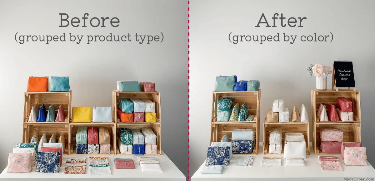
Remember, you don’t have to showcase every product you’ve made; sort products into color groupings and “hide” products that don’t fit seamlessly into a color collection by keeping them behind your table or tucking them behind products.
This article shares the steps to group your products by color: Craft Show Display 5-Minute Fix: Color Groupings
When you’re working with a craft show table that’s about 8 feet long, it’s best to stick within 3 – 5 groupings. If you have smaller products (e.g. soaps) you may be able to fit 5 groupings on your table without it looking messy. When selling larger items, such as pillows, you may only have room for 3 collections.
If you have a wide variety of products or product options, and you can’t group them into 3 – 5 themes, try to create 3 – 5 solid themes, and then create another grouping that is sort of a “catch-all”. This grouping should not be dominant in your display.
Using the art example, I’ve chosen my best-selling pieces to base my themes on (gardens, animals, landscapes). But I have several other paintings that don’t fit within those themes. I might set up 2 boxes/crates at the end of my table for those paintings. They’re still available to buy and shoppers can flip through them (like records at a record store), but they aren’t a dominant part of my display.
How to apply
Clean off your dining room table and set out all the products you’re planning to bring to the craft show.
Look for products or product features that work together.
For example:
- Color – you may be able to create collections that focus on just one color (e.g. a red collection, a blue collection, and a white collection). But if you have several color options, you may combine colors within a collection, e.g. red, blue, and white collection to create a nautical feel. Another collection may group pastel-colored pieces together, while another one uses neon-colored pieces.
- Pattern or texture – stripes and polka dots may work together to create a whimsical collection of products, while plaid pieces create a more masculine collection, and floral prints create a feminine collection.
- Product – if there’s too much variety when it comes to the colors or patterns of your products, simply grouping the same products together can create cohesion in your display. For example, all necklaces are grouped together, all earrings are grouped together, all bracelets are grouped together, and all rings are grouped together. This creates more of a statement than if they’re all mixed together.
- Purpose or lifestyle – you can group products together based on how they might be used/displayed/worn together. For example, a baby hat, headband, and handkerchief would create one grouping, bibs, and burp cloths would create another grouping, and baby blankets and stuffed toys create another grouping.
- Scent – a bath and body business may have a wide variety of products and scents and create collections by grouping all citrus-scented products, another one with floral scents, and another with spicy scents.
Start grouping like-items together on the table to see how they look as a collection.
Keep playing with different combinations until you have 3 – 5 groupings that make a strong, clean, and cohesive grouping.
It should catch your eye and shouldn’t have too much variation within it that it starts to look messy.
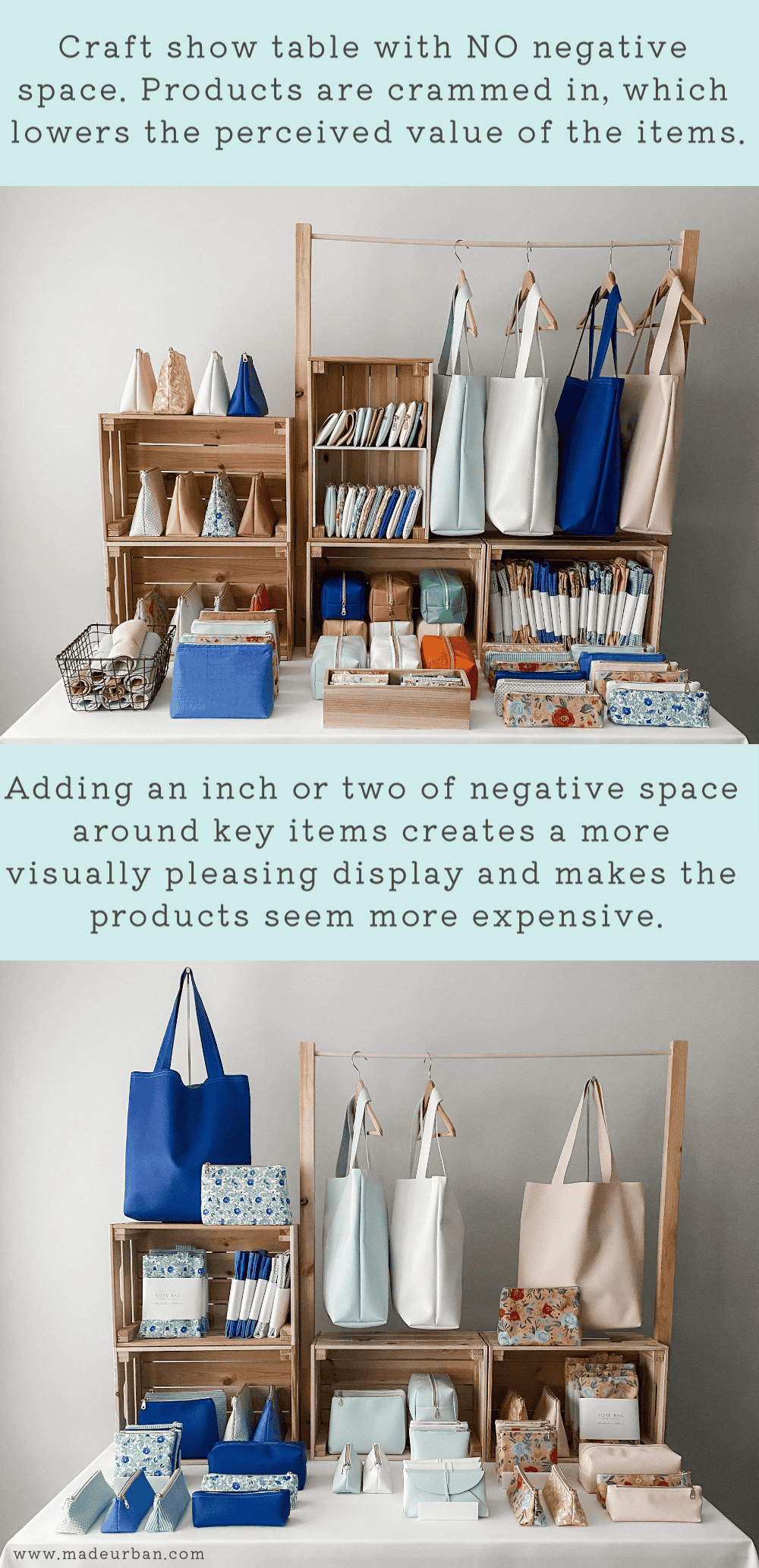
#3 – Negative space & editing
Negative space is the empty space that surrounds a subject. In this case, it’s the empty space that surrounds product groupings.
Negative space is like a palette cleanser for the eyes. Without it, a display can start to look cluttered.
And a cluttered space has the potential to lower the perceived value of your products.
Just think of the value you place on an item such as a necklace when it’s displayed on its own in a glass case, versus when it’s crammed on a jewelry tower with dozens of other necklaces. The necklace displayed on its own seems more valuable.
Here’s an example of a craft show display housing all products, not leaving room for negative/blank space between products. As well as an after photo when the product selection is “edited”, removing some items, which makes room for negative space.
Read more about how and why to add negative space to your craft show display: Craft Show Display 5-Minute Fix: Add Negative Space
Products, and product groupings, should not blend into each other; there should be space between them.
You may need to edit your product selection to achieve that space and to improve your display.
Grouping products together (into themes) will start to give your display some breathing space.
But if you can’t create clean groupings, or if you have too much stock for the table, it’s time to edit your selection and remove what’s nonessential.
The “nonessential” products can simply go in the “stock room” of your display; either at the end of your display or behind your table.
For example, let’s say I’m selling baby hats, headbands, handkerchiefs, burp cloths, bibs, baby blankets, and stuffed toys. I haven’t really thought about product collections so my fabrics are a wide variety of colors and patterns.
I would create 3 “display-only” collections.
*Display only – obviously these items are still for sale, but instead of displaying dozens of burp cloths and bibs together for my grouping, I would choose one burp cloth and one bib that look good together (maybe they’re the same color or pattern) and display them on a bust-form/display fixture.
I would find one of each type of product in the same color or pattern and create lifestyle collections:
- Grouping #1 – 1 blue striped hat, 1 blue polka dot headband, and 1 blue plaid handkerchief
- Grouping #2 – 1 pink floral burp cloth and 1 pink striped bib
- Grouping #3 – 1 grey plaid blanket and a couple of stuffed toys that are dominantly grey, black, and/or white
Then I would create a fourth section at the end of my table with baskets to hold all my stock.
For example:
- Basket #1 would hold all my stock in hats and headbands
- Basket #2 would hold all my stock in burp cloths and bibs
- Basket #3 would hold all my stock in blankets
- Basket #4 would hold all my stock in stuffed toys
If I had too much stock to fit into the baskets, I would fill them with a wide selection and then keep the rest in bins under the table.
The “display only” items would catch shoppers’ eyes and cleanly show the types of products I have for sale.
Once a shopper knows what they want (e.g. a burp cloth and bib), they can shop the “stock room” portion of my display.
If one of my “display only” items sold throughout the day, I would find another set of products that look good together and swap them onto the display fixtures.
This strategy also gives you an excuse to help shoppers and use your sales skills.
If someone is admiring your “floor model”, you can ask them an open-ended question. Such as “I have many more color options in that item…what’s your favorite color?”.
Once they tell you, you can sift through your stock at the end of your display, or behind the table, and pull out some options for them. As they view the options, you can dig a bit more to uncover what they do and don’t like to help them find exactly what they’re looking for.
How to apply
Once you’ve been accepted to a craft show, you should know how big your space is. Use your dining room table and tape off the amount of space you’ll have at the event.
Place your groupings within that space using the props you plan to bring.
Step back to look at your display and squint your eyes (this is a trick I learned when studying design and visual presentation and is one of the odd tricks I use at craft shows…read about the others here).
Squinting helps you get a feel for how your display will look from several feet away, when details can’t be made out. Dominant elements will also be more obvious to you when squinting. Which will help you shift things to create balance.
If your mock display feels messy, consider eliminating some pieces and creating a stock area.
Keep eliminating until you have clean groupings, space between them, and your display is eye-catching from several feet away (or when you’re squinting your eyes).
I hope these 3 “quick tips” help you refine your craft show display with limited time and budget!
For more tips and steps to take your craft show display to the next level, check out: 5 DAYS TO A STANDOUT CRAFT SHOW DISPLAY

Hey, I’m Erin 🙂 I write about small business and craft show techniques I’ve learned from being a small business owner for almost 2 decades, selling at dozens of craft shows, and earning a diploma in Visual Communication Design. I hope you find my advice helpful!
The information you’ve provided is of more value than most may believe. Ivebeen “crafting” for a very long time, but only doing occasional craft venues for the last 12 years. I made a lot of the mistakes you address. My tables were cluttered, displays were flat and even though I did group like items together the whole thing was too busy. When a name for our business is chosen, we must consider how it relates to what we make. I didn’t do that at the start and it confused people. Catchy names are great and can draw people in but if what they see doesn’t relate, they get distracted. When we start out or have limited budgets, we see displays and risers we’d love. Those can be created with a little imagination. Books, boxes, little crates anything with a wide enough flat bottom a a little height with fabric matching your theme works. I’ve used cigar boxes, metal lunch boxes, a cheap metal platter with a decent size block of scrap wood glued underneath, a wire waste basket, the possibilities are endless. Table cloths even thrifted aren’t always cheap and rarely in the color you want. Walmart sells the cheap flat sheets and even if you can’t sew, safety pins can box the corners neatly. There’s so much we can do to create an atmosphere on a tight budget. Thanks for the insight.
Thanks for sharing Tina! Sheets are a great idea to turn into a tablecloth! There are lots of good color options there. I agree, a little imagination and time can help you build a budget-friendly display 🙂
Sounds like you’re on the right track. Wishing you the best of luck!
Erin
Once you have your mock table set up. It’s important to walk away. By that I mean. “Totally leave.” If you possibly can for 15-30 minutes. Your perspective changes on what you see when you are surrounded with the thing constantly, than when you see them with “Fresh eyes.” As a stranger would. Leave for a bit, drive around the corner 3 times. Then you say, if I saw this for the very first time…or just open your eyes to it and truly use fresh eyes to see what others will see.
That’s a great tip Judy! It’s always great to take a breather from your work so you can try and see it with fresh eyes. Thanks for reading and commenting!
Erin