How To Use Repetition in a Craft Show Display
Repetition is important in all aspects of your business. It creates consistency and familiarity your customers can rely on.
Repetition is equally important in visual design and should be used in your craft show display.
Imagine a living room with white walls and grey furniture.
If you place one red pillow on the couch, it will look out of place.
But if you repeat that red color in other places (e.g. a red painting, red curtains, a red vase, etc.), the red no longer looks out of place.
The red accents catch the eye, direct your attention around the room, and create interest while pulling everything together.
We want to use repetition in a similar way throughout your craft show display.
Important Note
Repetition should start with your products.
However, this article is focused on the display elements that surround your products at a craft show.
I’ve left products out of these photos to give an idea of the type of foundation you can start with.
This type of setup won’t work for every product, but I hope the blank canvases (i.e. pictures of displays without products), will help you imagine your products in a similar setup.
Repetition in craft show display elements
Ideally, repetition in your craft show display will start with your products. But if you have a craft show coming up and your products are already made, or you’re not quite ready to narrow down your product selection so a theme is repeated throughout, you can still effectively use repetition in your display.
There are several ways to incorporate repetition in a display. Below are 5 options.
1 – Repeat Color
If you’re going to use repetition in one way, color is the way to go.
Choose 1 – 3 color(s) to repeat throughout your display.
Use your chosen color(s) in display elements such as:
- tablecloth
- backdrop
- display fixtures
- signage
- props
- your outfit
The more color variation there is in your products, the fewer colors you may want to use in your display.
For example, if my products use several different colors and prints/patterns, I might use one neutral color.
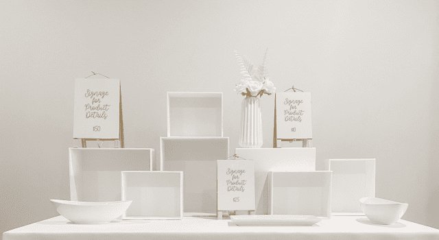
This type of setup (all white) can also work when you want contrast.
For example, the all-white display above would be a good background for a vendor selling turquoise jewelry. Although there isn’t a lot of color variation throughout the products, the simplicity of the display elements will help the jewelry pop.
On the other hand, if my products are a neutral color and there isn’t much variation from one product to the next (e.g. bottles of creams and lotions), I can use my display elements for a pop of color and repeat 3 colors throughout.
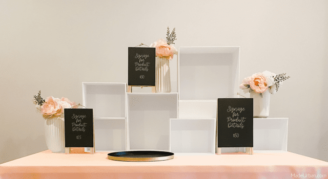
“1 – 3 colors” is a guideline and there may be more colors present in your display elements.
However, in most cases, 1 – 3 colors should be your most dominant, with additional colors used sparingly throughout your display.
For example, white, black, and pink are the dominant colors in the display above. But there are also touches of gold in the tray, wood in the signage, and greenery in the floral bouquets.
And there are exceptions to every rule…
An abundance of color can also work for some displays (especially for fun/playful/whimsical brands).
For example, pink, purple, blue, yellow, and orange can be used throughout a craft show display to make a fun, playful, and over the top display.
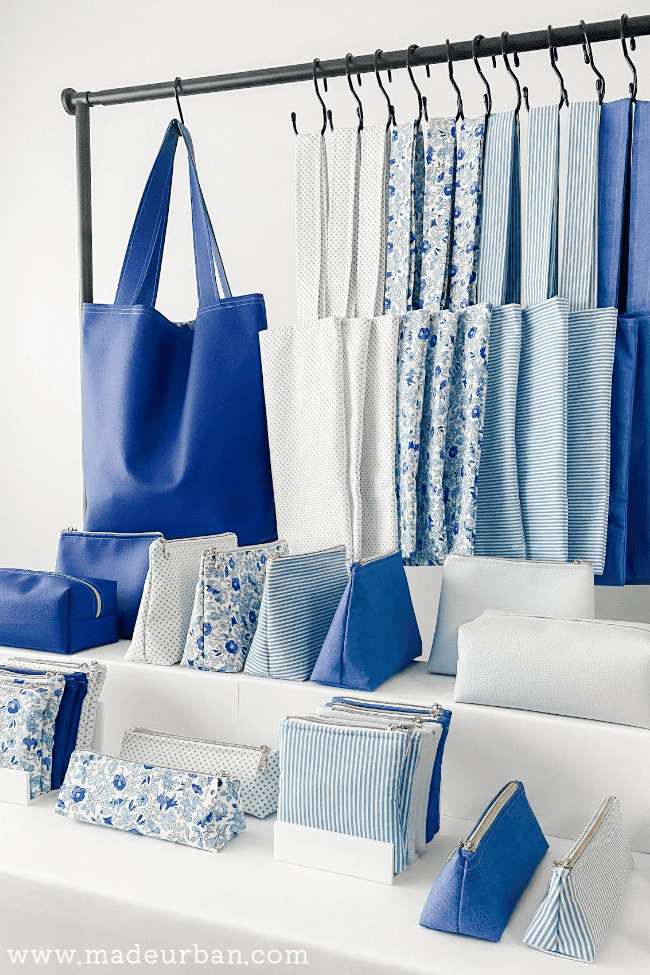
Here’s an example of repeating a color in your craft show display, starting with products. The repetition of blue and white makes a strong visual impact.
2 – Repeat Display Fixtures
Carrying your repetitive color into your display fixtures will help create unity and introduce repetition, but you can take it a step further.
Repeat size, shape, and/or style in your display fixtures (as well as color).
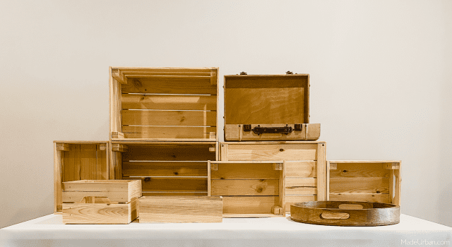
For example, in the display below, I’ve repeated color (wood finish) in all my display fixtures and have also repeated a rectangular shape in the majority of them.
I’m able to use different sizes and types of display fixtures without losing that cohesion. There are big, medium, and small boxes/crates, a wooden suitcase, and a wood tray.
When multiple types of display fixtures must be used, there should be at least one repeating element in all the fixtures.
For example, a jewelry display may require 4 different types of fixtures to display necklaces, bracelets, earrings, and rings. But if all fixtures incorporate the same type of finish (e.g. wood, or silver, or black velvet), it will unify the display. Here’s a great example of a jewelry display that uses a wood finish to pull everything together.
3 – Repeat Signage
At minimum, color(s) and font should be consistent across all signage.
To make more of an impact with my price and product info signs, I could keep the style, size, and/or shape of my signage the same.
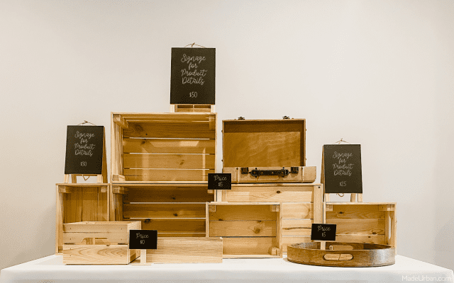
For example, in the display below, all of my signs are a chalkboard, they’re also all rectangular in shape and use white text in a script font. Because all of those elements are repeated, I can play with different sizes of signs without losing cohesion.
If my signage also includes photos of my work, I may not be able to stick to my color scheme. In this case, to create repetition, I might keep photos the same size, shape, and style, and hang/set them at the same height.
The more elements of your signage you keep consistent from one sign to the next, the more of an impact it’ll make.
You can even repeat every element of a sign for a statement.
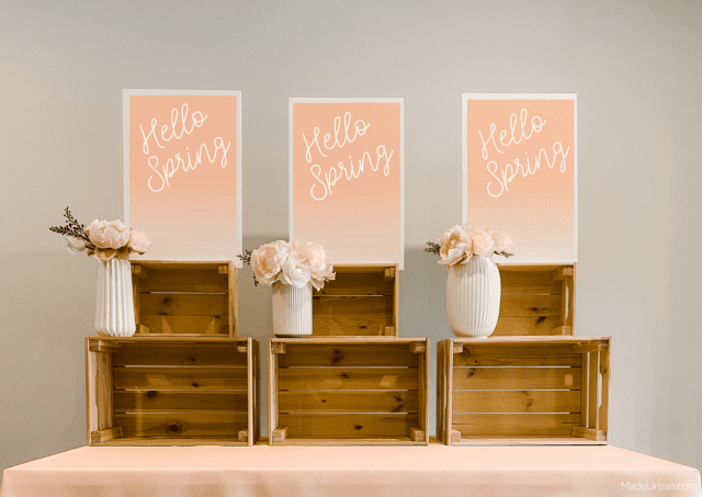
For example, I might take a photo of my best-selling piece, enlarge and print it, and repeat it 3 times in my space.
Or, I might create a “Hello Spring” sign to promote my new spring collection at a spring craft show.
4 – Repeat a Prop
Not every display needs props, but they can take a display to the next level.
Props add interest and can help tell a story or set a mood.
(I consider a prop different than a display fixture in that a prop is purely for visual interest; it’s not holding product.)
Using the same prop in your space more than once is another effective way to implement repetition.
The prop should also pull a repeated element from your display. It might incorporate a color, material, or theme that’s present in other parts of your display.
For example, I might pull pink into my prop, as well as a floral theme for spring.
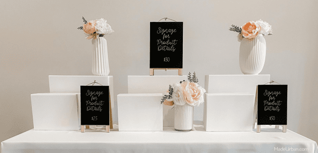
Sprinkling the same, or similar, prop throughout your display will help direct shoppers’ attention around your space.
5 – Repeat a Pattern
A pattern may come from a material or texture in your products, or it may be a pattern you create with the composition of display elements.
For example, I may use the same floral-print material from one of my handbags, as my tablecloth and/or backdrop.
A vendor selling knitted goods may repeat a stitch pattern in their display. They might paint a “rib stitch” pattern on a tablecloth or display fixture, or incorporate it into signage.
A pattern can also be created through the way you set up display elements.
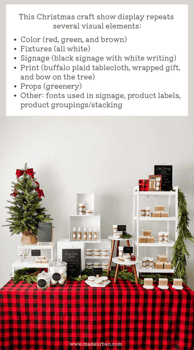
For example, I could set up my risers, props, and signs in a way that creates a repeating pattern (you can also do this with your products).

Repetition Tips
Here are a few other tips when it comes to using repetition in your display.
Odd numbers
When repeating an element, odd numbers are more visually pleasing. When you can, repeat a color, shape, sign, etc. 3 – 5 times.
Variation
Repetition doesn’t necessarily mean an exact match, but rather, shared elements.
For example, my signage may be the same font printed on white paper and displayed in a white rectangular frame. The size of each frame can vary and the signage will still look cohesive.
Keep it simple
When in doubt, keep it simple. Start with a neutral color and repeat it throughout your display.
A white tablecloth, white display fixtures, white frames for signage, and a simple black font printed on white paper, will immediately make a display look more professional.
As you get more comfortable with creating a display, you can introduce more elements to repeat.
Questions? Let me know in the comments! Or let me know how you plan to use repetition in your craft show display 🙂

Hey, I’m Erin 🙂 I write about small business and craft show techniques I’ve learned from being a small business owner for almost 2 decades, selling at dozens of craft shows, and earning a diploma in Visual Communication Design. I hope you find my advice helpful!

All of my events are outdoors so wind can be a real problem with signage and displays such as risers and busts. Do you have any suggestions for dealing with weather for those of us who are strictly outdoors?
Thanks
PS Love your articles and recommend you to other crafters
honestly I’ve had this issue in the past but I hot glue my signage to my crate. and then I do decorative rocks in the crate to hold it down and in the bottom of the vase. hope that helps. 🙂
Hi Ethel,
Thank you so much for reading and recommending my blog to others! 🙂 The wind definitely makes it more tricky. Do you typically use a tent at outdoor events? If yes, you might consider adding side and back walls to it to cut down on wind.
I would also recommend choosing heavier fixtures. The wood crates in my pictures are from Ikea and have a decent amount of weight to them. If you had a way to temporarily attach them together, using zip ties or twine, it would be one heavy unit that the wind probably wouldn’t be able to pick up.
On top of that, you may also add small weights inside the crates. You could even find a way to make them decorative. If you Google “diy decorative concrete paper weights” you’ll see some good examples.
For signage, perhaps you can find a way to attach it to your display fixtures. For example, using the 3M stickers (the ones that pull off clean) to press and stick a sign to your wood crate. Or if you’re using a lighter weight sign (e.g. poster board or foam core, you might punch two holes at the top and bottom and use some decorate ribbon or twine to tie the signs to your display fixtures.
I think decorative weights, tape (that won’t show and won’t leave a residue), and twine/ribbon will be your best friends on windy days.
I hope that helps!
Erin
These display ideas are brilliant and beautiful. I am totally going to implement them into my market displays as well as my store. Thank you!
Classic use of graphic design principles: repetition, proximity, color, hierarchy etc. Question re: display of hand-knit baby sweaters. I have a 6′ table with varied heights displaying the sweaters upright. The table is getting tight. Folded sweaters don’t seem to work. Any ideas?
Thanks.
@ButtonedUpKnits
Hi Erin,
I just found you and love your ideas. After, few years I am coming back to craft shows and I have a “problem” that I always find with my products. I only sell one product (a sweet treat) available in different flavours and different boxes. I have them available for people to mix and match and create their own boxes. How do you recommend that I present them? I tried soap boxes, buckets…but I can’t get height the table looks always flat and the only thing that I have to showcase are the gift boxes, but they are empty. I love the craters that you used in the example, how can I use them to hold “cookies” for example?
I sell totes and will be at an indoor craft fair. I want to do the z layout but I have no idea how to display my totes. I was thinking of using my tent frame and putting fairy lights all on the frame. I have a pegboard display and two rectangular tables. Any ideas?
Any tips on displaying kids hair bows at craft shows?
Have you considered a vertical display? (either hung from the outside of the tent or down the draped wall) Obviously, put some at kid-height but put most as adult-height. Image hanging twine from the metal part of your tent. Attach the bows to the twine. Have a multiple of 5-7-9 vertical strings hanging down each side of the tent. I couldn’t find a visual of what I’m talking about but I hope that helps. And if it’s a windy day, have the twine go all the way to the ground and anchor with a rock.
Those are such great tips. Thanks for sharing. What would you suggest or recommend for greeting cards? Any do’s and don’t’s? Huge craft fair coming up and I want my table to pop!! Thanks