What to Put on a Craft Business Card
There’s so much we want people to know and understand about our businesses. But sharing all the information at once makes it overwhelming for potential customers. So how do you determine what to include when it comes to marketing material such as business cards?
- Which information is important to share and where?
- What’s going to grab attention?
- What do your potential customers care about?
- And how do you communicate it in a clear way?
These questions apply when determining copy for a variety of areas in your business:
- Website’s home page
- Bio or About page
- Craft show signage
- Flyers
- Posters
- Etc.
Use this article to narrow down what you should put on your craft business cards, or any other piece of marketing material.
You can, of course, keep things simple and include the basic information required on a business card. Such as:
- Business Name
- Tagline or brief description of what you sell
- Website URL
- Contact Information
However, since 80% of business cards tend to end up in the trash, I thought I’d offer a few ideas to make your craft business cards more impactful and create more opportunities for sales.
Try thinking of your art of craft business card as a piece of marketing material…a tiny billboard or advertisement for your business; not just a list of contact information.
Let’s get creative and design a craft business card that gets people wanting to buy from you.
1. Craft Business Identity
There are no rules when it comes to the information you include on your craft business card but it should absolutely communicate the identity of your business.
That may be through your business name/logo, or through your branding.
Your business name and/or logo don’t necessarily need to be the biggest and boldest element of your card. You may find, after reading this article, there’s a more important message you want to convey.
You may even find you want to pique curiosity by EXCLUDING your business name, in an attempt to get people holding your business card to visit your website.
For example:
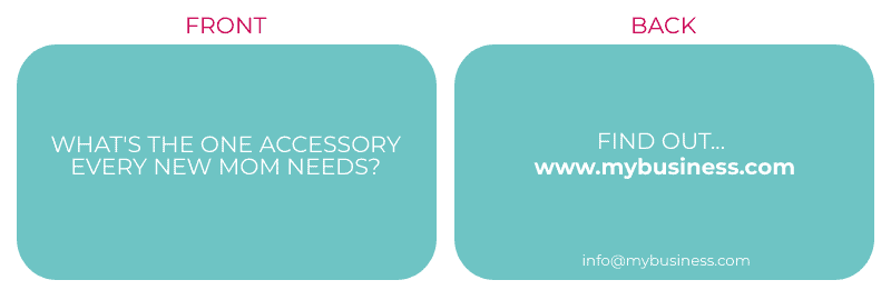
They may be so curious to find out they head straight to the website, where they could find the most stylish and organizational diaper bag.
If you don’t share your business’ name or logo, you’ll definitely want your business’ identity to come through with the branding of your card.
You can communicate whether your business is feminine and modern, rugged and masculine, dark and moody, or playful and whimsical through elements such as:
- Type of paper the business card is printed on
- Shape of the business card
- Colors
- Fonts
- Wording
- Icons or images
2. A Call To Action
What’s the most important action you want people to take after receiving one of your business cards?
You may feel you want to squeeze all your information on there, such as:
- Website URL
- Email address
- Facebook Page name
- Instagram Account name
- Twitter handle
- Phone number
- Location
However, it may start to look overwhelming.
If you choose a main purpose for your business card (aside from simply listing information), you can create a focal point around that purpose and let other information be in the background, or uncovered someplace else (e.g. they’ll find links to your social media pages once they’re on your website, but that information may not be necessary on your business card).
Do you want people to visit your website, OR email you, OR follow you on social media?
If you have a better chance of making a sale when people visit your website, you might choose to make your website’s URL the focal point of your card.
On the other hand, if you find more people buy once you’ve had a one-on-one interaction with them and are able to uncover their needs before directing them to a specific website page, perhaps your email address should be front and center.
You may still want to include your website URL and/or social media accounts, but they should play a supporting role.
When you choose one focal point, you tell the person holding the card, where to look first and what’s most important.
Sort of like bigger, bolder text will highlight key points in an article. Or a bigger, bolder display in a store will highlight important products.
A long article without the visual breaks of headers feels overwhelming. And if scanning, you don’t immediately know where to look.
A store with racks and racks of clothes, all hung the same way, doesn’t tell you where to start shopping and may feel too overwhelming to sort through.
People scan.
If there isn’t something on your business card to catch their attention in a matter of seconds, they’ll likely take a quick glance and put it in their purse, pocket, business card storage box, or worse yet, the trash.
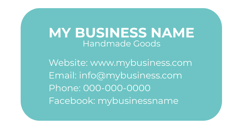
See how the eye glances over this business card? The name text stands out, but we want people to do more than simply learn or read your business’ name.
Versus making one element the focal point to catch attention and create intrigue:
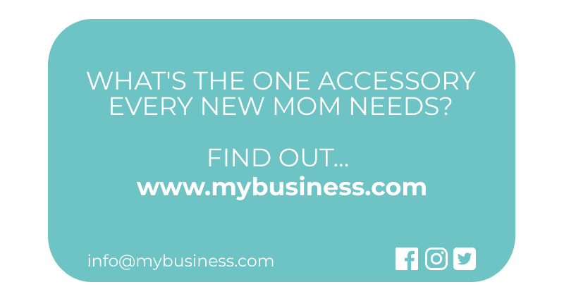
This business owner wants people to visit their website, so the card is focused on their website URL, with their email address being available, but not sharing the spotlight. They’re also making people aware they’re on Facebook, Instagram, and Twitter, but the icons are subtle and not encouraging them to visit those pages over their website.
Here’s how you might decide what to highlight on your business card:
WEBSITE URL
If you have a website or Etsy shop, this is probably the most important information to highlight, as you likely want people who grab your business card to visit your online shop so you have the potential to make a sale.
Also, consider if there’s a specific website page you’d like to direct them to.
For example:
>> A craft vendor who offers a discount to first-time customers may point them to the page with information about that discount.
>> A vendor selling high priced items may require several interactions with a potential customer before they’re ready to buy. A newsletter is a great way to stay in touch, educate them about products, and regularly pitch products. They may want to direct business card holders to their newsletter page (here’s how to set up a newsletter signup page right now…like in 10 minutes…even if you don’t have a website yet).
>> Someone who sells bath and body products may prefer to promote their sets over individual items (e.g. a soap, toner, and lotion set instead of a bar of soap or a jar of lotion). They could direct people to their “skincare sets” page.
>> A vendor printing a small batch of cards for the holidays may want to promote their holiday collection and share a link to where they’re featured (e.g. www.YourWebsite.com/HolidayCollection)
If you want to track the conversion rate of your business card, use a landing page that is unlikely to be visited by anyone other than people who hold your card.
For example, the URL of that page may be www.YourWebsite.com/Perks. The page may offer a small perk, such as a promo code, and include links to shop the rest of the website. If there isn’t a tab pointing to the “perks” page, it’s likely that the only people who know about it are people who have a business card.
Then you can use Google Analytics to track how many people visit that page and compare it to how many business cards you handed out. That will tell you how effective your business card is.
You can do something similar to track the success of each craft show or event.
For example, if you’re participating in a big trade show and the purpose of the event is to drum up future business (e.g. a wedding photographer may not be selling their photography that day but they hope to get bookings because of the event) or to attract wholesale orders from retailers, you may want to know how much business came to you because of the event. In which case, you can set up a landing page for that specific event and share that URL on your business card. E.g. www.YourWebsite.com/NameOfEvent.
EMAIL ADDRESS
An email address should be included on almost every business card but it doesn’t have to be front and center. And that email address should be professional.
The best option is to have your own domain name, which you can then use for your email address.
So instead of:
YourBusiness@hotmail.com or YourBusiness@gmail.com
You could set up:
info@YourBusinessName.com or hello@YourBusinessName.com
An email address using your domain name simply comes across as more professional.
It’s certainly not required though and you can also use YourBusinessName@gmail/hotmail/yahoo until you’re ready to purchase a domain.
The last option would be to use your personal email account. It can work if your name is associated with your business and is used in your email address.
For example, your business’ name is “Jane Smith’s Designs” and your email address is JaneSmith@hotmail.com
However, it’s best to set up a new email account for your business to keep personal emails and business emails separate.
SOCIAL MEDIA ACCOUNTS
You may share the URL of a social media account if that’s what you currently use as a makeshift online store until you set up an Etsy shop or website.
In this case, you could include one social media URL, however, the URL of every social media account you’re on may be overkill.
If you were lucky enough to grab the exact username as your business’ name on each social media account, you can keep things nice and clean by simply adding the social media symbol for each platform you’re on.
For example, my business’ name is Made Urban and I was able to register as MadeUrban on Facebook, Pinterest, Instagram, Twitter etc. So I could simply add those icons and people would know they could search “madeurban” and find my account, or type the social media’s url followed by “/madeurban” and find me that way.
How To Write an Instagram Address On A Business Card
To write your Instagram address on a business card, it’s important to share your account’s “username”, not your account’s “name”. This will make it easier and faster for people to find the right account.
For example, let’s say I wasn’t able to get the same username as my account name and had to choose “madeurbanblog” as my username, but “Made Urban” shows as my Instagram account’s name. I would share “madeurbanblog” on my business card, because that’s what people would need to type in to quickly find my account.
Here are a few ways to add your Instagram address:
- Write the full link: Instagram.com/username
- Icon & username: instead of writing out “Instagram.com“, you can simply add the Instagram icon and write your username next to it
- Icon & “@” with username: add the Instagram icon next to @yourusername
PHONE NUMBER
If you tend to get a lot of questions (e.g. you sell high-end art or photography services or bake wedding cakes) or typically require a consultation to make a sale, and you know your conversion rate goes up when you can have a conversation with a potential customer, a phone number may be what’s most important to highlight on your business card.
PHYSICAL ADDRESS
If you’ve opened a physical store or are promoting a temporary pop-up, you’d obviously want to encourage people to visit that store by including its address and making it the focus.
Or, if where you’re based is a big part of your business, you may want to include the location.
For example, someone creating Alberta-themed products or who relies heavily on local sales may want to highlight “Alberta” on their business card.
Determine the action you’d most like people to take, the information they need to do so and then add additional information if required.
3. The Benefit
Next, think about what people get out of taking the action you’ve asked them to take.
People may visit your website after taking a card and seeing your URL front and center. But they’ll be more likely to visit it if you give them some type of incentive.
>> How are they going to benefit by taking that action?
>> What would get them check out your website as soon as they get home?
>> Why might they add booking a call with you on their to-do list?
CTA
You can start with a call to action. For example:
- Visit my website
- Email me
- Call me
- Follow me
A call to action (CTA) alone will encourage more people to take action.
But adding a benefit to that CTA is even better.
BENEFIT
Explain what’s in it for them if they follow your call to action. You obviously don’t have a lot of room on a business card so you need to find a way to keep it short and simple.
For example:
Let’s say you have a giveaway each month and choose winners based on who’s mentioned your business on social media and used a unique hashtag.
Your CTA + benefit may be:
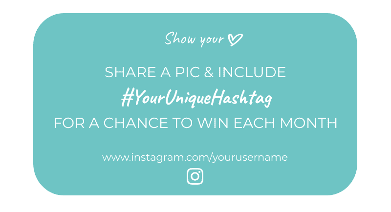
*Business name, website and email could be printed on the other side of the business card.
Some more examples:
>> A wedding photographer booking up for the season, or a vendor who offers custom orders but has limited spots, may have a business card that reads: “Save your Spot!” followed by the benefit: “Limited custom orders accepted. Email me to claim your spot info@YourBusinessName.com”
>> “See the latest trends” may go above a website URL if a brand is trend-based and the website is kept up to date with the latest trendy products.
>> “Save on your first order” or “Get free shipping” may be included with a URL (e.g.www.YourWebsite.com/freeshipping) directing people to a website page sharing how they can get a discount or free shipping.
>>www.YourWebsite.com/discounts might lead to a page that has your newsletter signup form and explains that people on your email list receive exclusive offers, first dibs on new collections, and a promo code to receive a discount on their first order.
>>“Limited Quantities” might encourage someone to visit your Etsy shop sooner than later.
>>“Discover your key to beautiful skin” might accompany a URL that leads to a page where they can take a free quiz to uncover their skin type and ingredients you recommend they include in their skincare regime and ones to avoid.
>>“Call for a free estimate/personalized recommendation/etc.” would work alongside a phone number if you sell services such as painting at a kid’s party or offer art/decorating recommendations for a space.
>>“Let me help you shop” could work next to a store’s address and hours if you can help them accessorize an outfit, choose décor pieces for their home, or pick out the perfect gift.
>>“Follow for giveaway updates” could get someone to follow you on your most popular social media platform.
Think about why your potential customers might care about visiting your online or offline shop, emailing you, calling you, or following you on social media.
You may even pique curiosity.
Especially if people aren’t in front of your products when they receive a business card (i.e. if you’re mainly handing out cards at craft shows, people will know what you sell and this method may not be as effective).
>> “Wanna know how I finally started sleeping through the night? www.YourWebsite.com” (*could even link to an “About” page which would share a personal story)
>> “Do you know what the perfect gift for Dad is? You know, the guy who has everything and wants nothing? I do… www.YourWebsite.com”
>> “Trying to figure out the perfect bridesmaid gift? You’ll find it here www.YourWebsite.com”
You wouldn’t want to give the answer away on your business card so if your business’ name or tagline gives it away, you’d leave it out.
USP
Your USP is your unique selling position; what you do better or different than your competition. (It’s NOT your tagline but can be used to develop one.)
If you have a good USP that communicates the benefit of purchasing from you, include it on your business card. That may be in the form of a short description, a tagline, or a slogan.
It may be combined with, or in place of, the benefit or call to action.
For example:
>>“Do your part for the planet. Wear cruelty-free wool. Visit: www.YourWebsite.com”
Using cruelty-free wool is the USP, helping the planet is the benefit, and “visit www.YourWebsite.com” is the CTA.
You can use one side of your business card to grab attention and encourage action, while the other side includes necessary information (e.g. Business name, email address & website).
4. Something Memorable
Let’s say your card gets tossed (as unfortunately, most do). You want them to remember as much information as possible.
You might add visual elements that relate to your business.
For example:
>> If a business name included the word “pink”, the color of the card may be bright pink.
>> If a business name included the word “owl” or the business only sold owl-themed products, there may be an outline of an owl or the card may be cut in the shape of an owl.
>> Someone who sells succulents in concrete planters may use a background image on their card that makes it look like a piece of concrete.
It may even be a clue that helps them remember your USP.
For example:
>> If a brand is environmentally friendly they may include on their business card: “Even this card is made from recycled material”.
That may help a business sewing bags out of recycled material stand out as THE earth-friendly option for purses. If that brand has created an SEO-friendly website, it should show up when someone Googles “bags made of recycled materials”. So although they may not remember the business’ name, they remember enough information to find them.
You may also give your business card a second purpose so there’s more incentive to hang onto it.
For example:
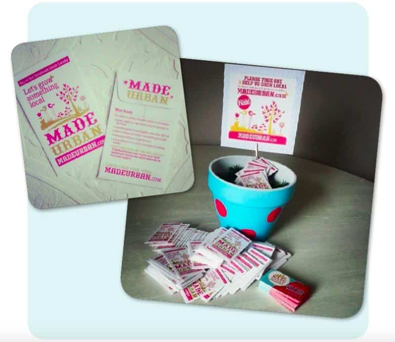
>> You may print your business cards on seed paper, which allows someone to plant the card, water it, and grow flowers.
I used a similar idea when we first launched the marketplace side of Made Urban (more about the Made Urban marketplace and where it went here).
I had my business cards printed on business card-sized envelopes. The front promoted the local marketplace with “Let’s grow something local” and our tagline, seeds were inside the envelope, and the back had instructions to plant the seeds.
At craft shows, I placed the business cards in a pot, painted in our brand’s colors:
>> Maybe your business card acts like a punch card. Once they buy X number of products, they receive a free gift or a discount on their next order.
>> It could also be a coupon they can present to you at a craft fair to receive a discount (don’t forget an expiry date).
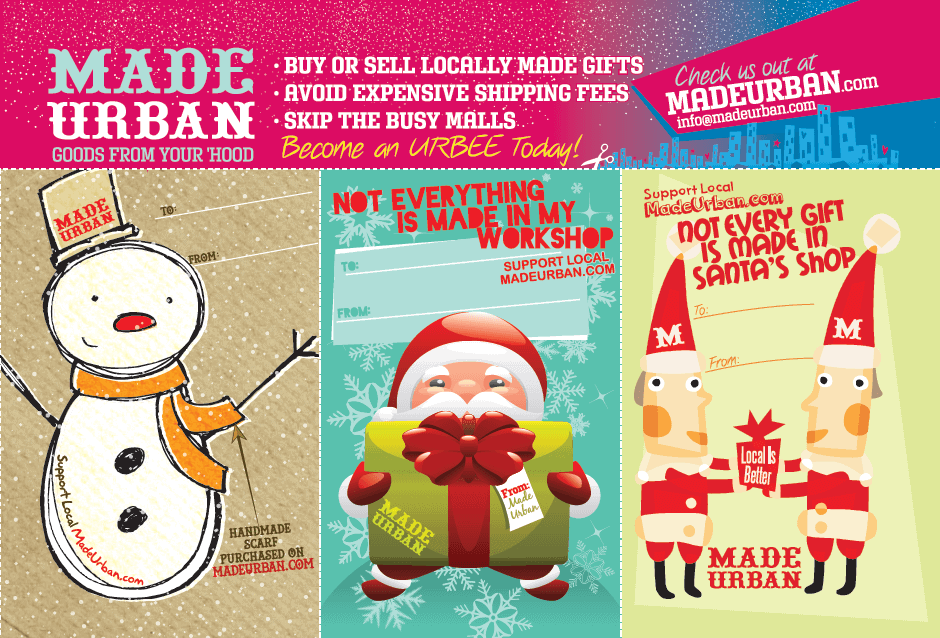
>> Your business cards could double as a gift tag during the holidays, leaving space for people to fill in who it’s “to” and “from”. When they include the card with their gift, the recipient can then check out your website. The back may suggest “Visit www.YourWebsite.com for care instructions / how to wear / tips to use / etc.”
Here are a few more examples of our old postcards. One that could be cut into 3 sections and used as gift tags.
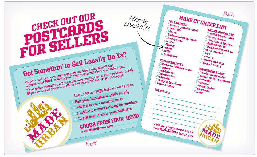
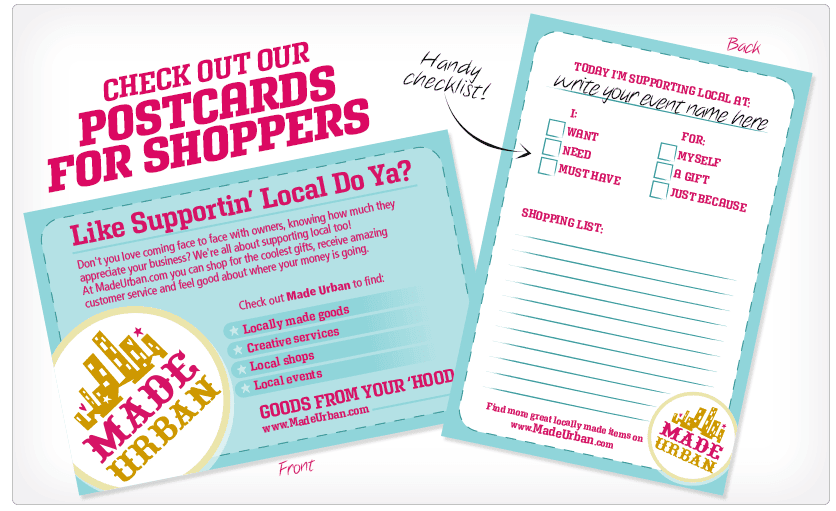
And another that was to promote the marketplace side of Made Urban (which has since been shut down. Find out why here) at craft shows. One postcard was for craft show vendors and had a craft show checklist on the back.
And the other was for craft show shoppers and had a wishlist/shopping list on the back:
There are also printing services that can print business information on a variety of items.
For example:
>> A vendor selling hand care products (e.g. hand lotion, nail polish, cuticle oil, etc.) may have their business information printed on small emery board.
Of course, always weigh your return on investment before spending a lot of money on a unique business card idea.
Test printing a small batch, track their conversion rate as best as you can, then order more if they prove to be profitable. If you don’t make any new sales because of the business cards, try a new idea or consider if you even need business cards. If your entire business is online, it may be better to spend your time and money on online marketing.
Did this article spark any ideas for your next business cards? Please share in the comments. I’d love to hear them 🙂

Hey, I’m Erin 🙂 I write about small business and craft show techniques I’ve learned from being a small business owner for almost 2 decades, selling at dozens of craft shows, and earning a diploma in Visual Communication Design. I hope you find my advice helpful!

Thank you so much for this article. It is so timely for me as I plan to reorder my business cards this week. I have wanted to change the layout a little but wasn’t sure exactly what I wanted to do. Now I do…so thank you for the suggestions and the incentive.
Deane Bowers
DeaneVBowersArt
Charleston, SC
Great to hear Deane, so happy it helped 🙂
Erin
As always Erin,
Such timely info with so much thought and expert advice given.
I am changing my “craft” focus to be whete my true passion lies.
This is so helpful as remindes of all the things I have read and learned in snippets here and there. Best is you have it covered in ONE place.
Thank you!
Angela Moisey
@angelsmoiseycreative
Thanks for your continued support Angela! So glad I can still offer advice that gets you thinking 😉 Keep me posted on your new focus.
Erin
Excellent article and REAL tips. On my current card I have several small pictures of my different silk product designs on back. I’ve had a lot of success with it, but need to redesign the front! Thanks for the info!
Thank you so much Candace! So glad it was helpful 🙂 Pictures of your work is another great idea.
Erin
Thank you for the wonderful information. I currently have a postcard size card with 3 thumbnail photos on it. I’m happy with how it looks. I like your idea about offering a discount at future craft shows…as I will be doing one that has multiple dates starting in November. Thank you again for all the useful information.
That’s a great idea too! A postcard size gives you a lot more room to work with. You may also have room to add the dates of all your November shows so they know exactly when and where they can use the coupon.
Erin
You have definitely given me alot to think about .thanks
Great to hear! Thanks for reading 🙂
Erin
Thank you for all your great ideas! I’ve been neglecting printing my business cards because I knew I needed to change it up, but didn’t know how.
Love your business tips! Thank you for sharing your experience and knowledge.
Every article of your blog is powder gold.
I am fascinated with the detail level and passion of every tip and consideration you give away.
Thank you so much for your generosity!
Thank you… the article was very informative.
Awesome ideas. I have always struggled with business card information so this REALLY helped me out.
You are wonderfully creative and excellent at sharing your wisdom. Thank you for all the tips and insight. Your article inspired me.